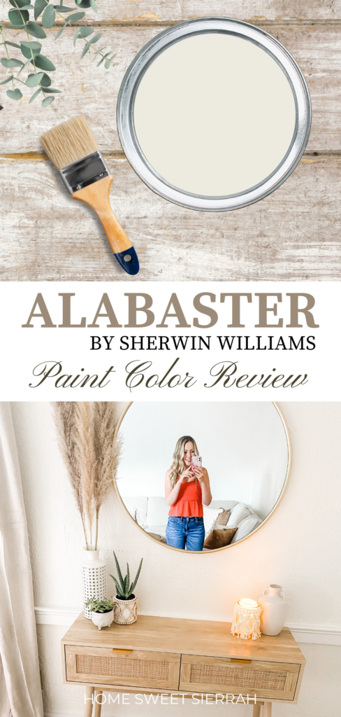
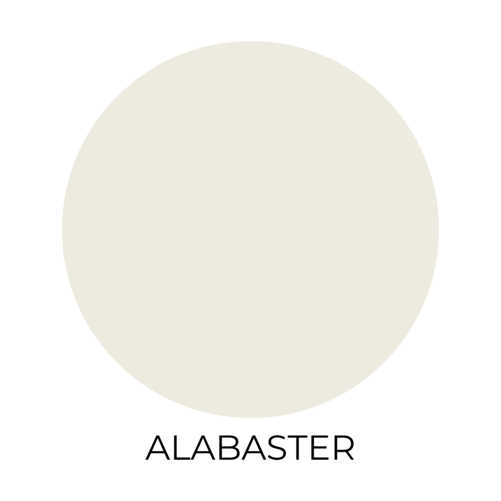
When I first decided to refresh my space, Sherwin Williams Alabaster immediately stood out. It’s a warm, inviting white with subtle depth, thanks to its creamy undertones.
With an LRV of 82, Alabaster strikes a perfect balance, reflecting natural light without overwhelming the room.This makes it an excellent choice for trim, cabinets, or in my case, a whole home paint color.
I found that Alabaster seamlessly adapts to various decor styles and accent colors. Whether your space leans traditional, modern, or somewhere in between, this shade offers a cozy vibe that feels anything but stark.
Alabaster was named the Sherwin-Williams Color of the Year in 2016, and its enduring popularity is well-deserved.
What truly sold me was how Alabaster interacts with natural light. In my living room, it enhances the space during daylight hours by maintaining its warmth and neutrality.
This versatile color has become my go-to favorite for creating a welcoming light and airy atmosphere.
This post contains affiliate links. For more information, please read my disclosure here.
Understanding Alabaster
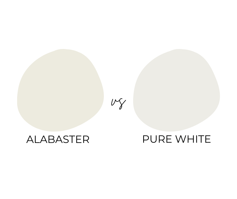
Sherwin Williams Alabaster is a popular off-white paint known for its warmth and versatility. It’s often compared to similar shades like Pure White.
Here’s what you need to know about Alabaster, its differences from Pure White, and its Light Reflectance Value (LRV).
The Basics of Sherwin Williams Alabaster
Alabaster by Sherwin Williams is a creamy off-white paint. It’s warm with subtle yellow undertones, making it a favorite for creating cozy spaces.
This shade is ideal for living rooms, kitchens, and bedrooms. It works well with both modern and traditional decor styles.
I’ve also noticed it pairs beautifully with neutral tones and warm wood accents. This flexibility makes it a staple for many interior design projects.
Alabaster vs. Pure White
When compared to Sherwin Williams’ Pure White, Alabaster stands out for its warmth.
While Pure White has a brighter and cooler tone, Alabaster offers a softer, more inviting feel.
Pure White is often chosen for trim or ceilings due to its crispness. Alabaster, with its cozy vibe, makes spaces feel inviting.
I prefer Alabaster for walls where warmth is desired, while Pure White can add a refreshing contrast.
The LRV of Alabaster
Alabaster’s Light Reflectance Value (LRV) is 82, which means it reflects a lot of light. This high LRV makes Alabaster great for rooms that need brightening.
LRV can also help me determine how the paint behaves in different lighting.
In bright sunlight, Alabaster maintains its richness without appearing too stark. Its warm tone can soften harsh lighting, enhancing the ambiance of a room.
Alabaster’s Aesthetic Appeal
Alabaster by Sherwin Williams is celebrated for its warm and inviting qualities. It is often described as a creamy white that enhances spaces with subtle elegance.
The Color Profile
Alabaster is a soft, warm white, making it a versatile choice for both modern and traditional settings. It’s not just a plain white; it has depth and character.
The paint has a Light Reflectance Value (LRV) of 82, which means it reflects a good amount of light without being overly stark.
I’ve seen it used beautifully on walls, creating a soft backdrop for bolder accents. It’s a color that contributes to a soothing and balanced atmosphere in any room.
Warmth and Undertones
What sets Alabaster apart is its hint of warmth. The undertones are subtle greige, giving it a creamy, inviting feel.
It’s similar to another favorite, Greek Villa, but Alabaster tends to be slightly warmer.
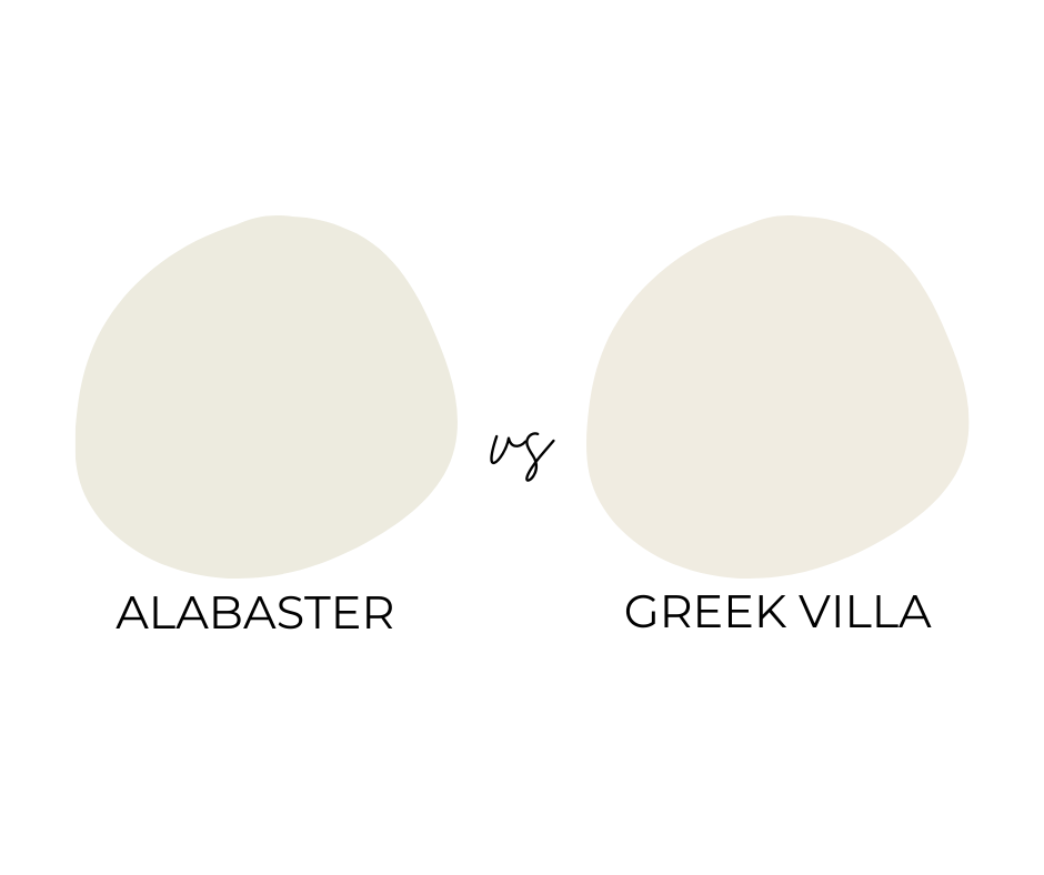
The warmth is evident in the way it complements both warm and cool tones, allowing for flexibility in decor.
I think it’s an exceptional choice for creating cozy yet refined spaces.
Whether paired with hardwood floors or colorful artworks, the undertones ensure that Alabaster fits seamlessly.
Alabaster in Different Lighting
Lighting can dramatically impact how Alabaster appears.
In north-facing rooms, it maintains its warm characteristics without turning too cool. It seems to hold onto its creamy quality, making the room feel more inviting.
For east-facing rooms, the soft morning light enhances its lightness, giving the space a refreshing feel.
In west-facing rooms, the evening light can cast warm glows, deepening the undertone, which can create a more intimate atmosphere.
I always recommend sampling it in different lights to see how it plays throughout the day before committing to a whole room.
Practical Applications
I find Sherwin Williams Alabaster to be incredibly versatile, adapting well to various spaces.
Whether you’re updating your kitchen, giving your interior spaces a cozy vibe, or refreshing your home’s exterior, Alabaster provides a warm, inviting look.
Ideal Uses in Interior Spaces
For interior spaces, I love how Alabaster can transform a room. It’s perfect for creating a bright, airy feel, without the starkness of a pure white.
Alabaster works fantastically for walls and trim color. The soft, warm undertones bring out a cozy, welcoming atmosphere.
In living rooms and bedrooms, it pairs beautifully with both light and dark furnishings.
Greige and taupe tones make particularly good companions, giving your space a harmonious look that isn’t overwhelming.
In art studios or home offices, Alabaster provides an energizing yet calm backdrop for creativity to flow.
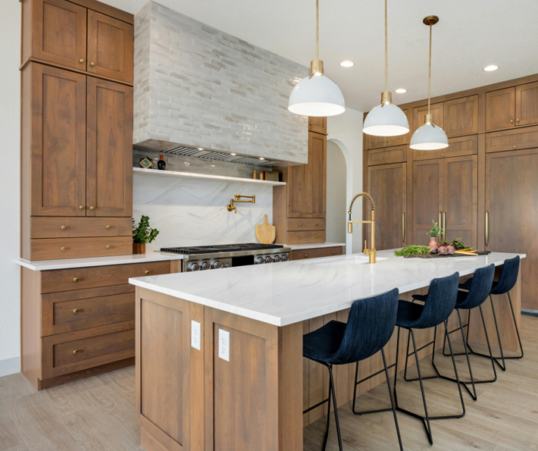
Alabaster in the Kitchen
In the kitchen, I adore Alabaster kitchen cabinets. The subtle warmth of Alabaster pairs beautifully with various countertop materials like marble or granite.
It gives a clean yet inviting feel, helping smaller kitchens appear more open.
For those of us who love a cohesive look, white cabinets in Alabaster color offer a classic, timeless appeal.
The light reflective value of Alabaster provides ample brightness, making it a practical choice for kitchens that lack natural light.
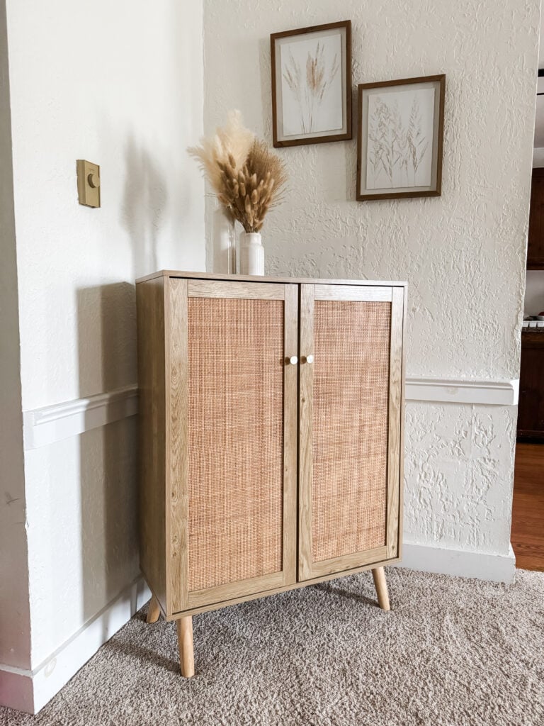
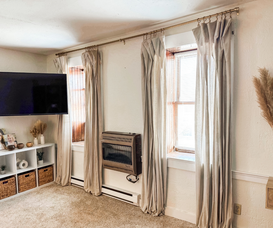
If you’re considering Alabaster for your living room, I can highly recommend doing so. It completely transformed my living room, going from dreary to light and inviting.
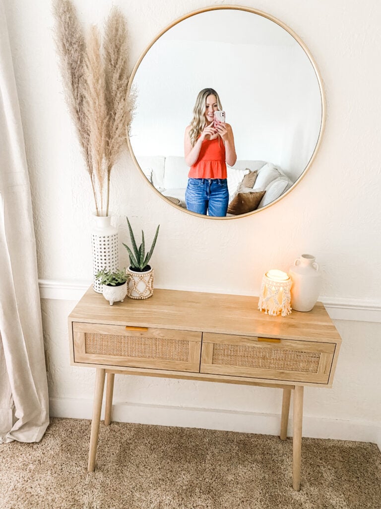
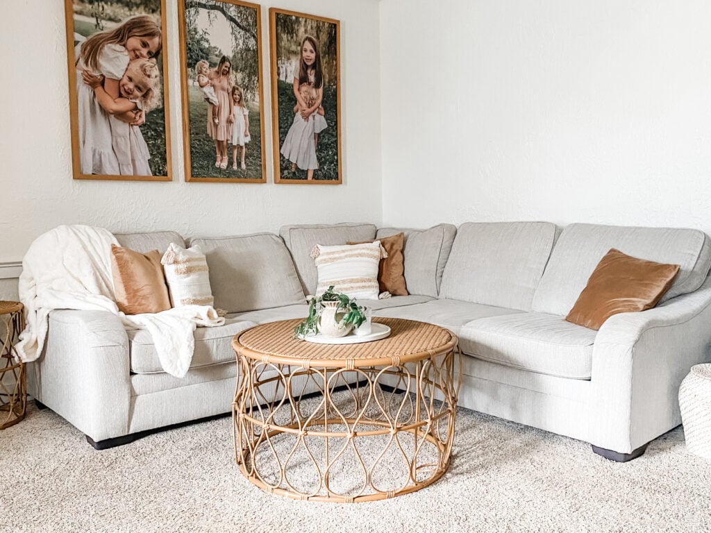
Here are a few photos of Alabaster in natural lighting. These are from my living room at different points in the day.
Shop the look:
Shop the look:
Shop the look:
Shop the look:
- frames
- tray
- vase
- throw pillow case
- throw blanket
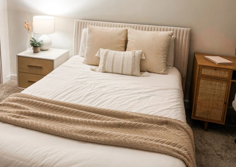
If you’re considering Alabaster for your bedroom, here are a few photos of mine. These show what alabaster looks like in artificial light since my room doesn’t get much natural light.
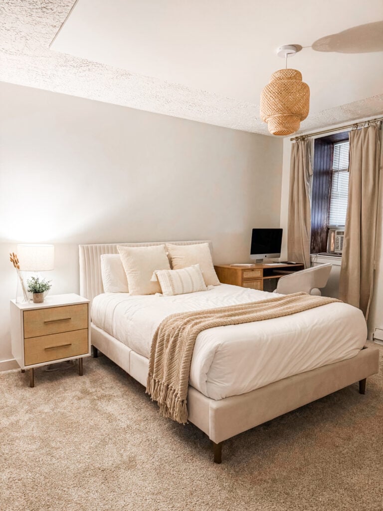

Shop the look:
- nightstand
- lamp
- vase
- plant
- bed frame
- large pillow covers
- small pillow cover
- duvet
- throw blanket
- desk
- hanging light
Exterior Uses for Alabaster
When it comes to exterior paint, Alabaster shines as an all-around fantastic choice. It strikes a great balance between standing out and blending harmoniously with natural surroundings.
The warmth of Alabaster creates a welcoming facade for any style of home.
You might enjoy using Alabaster for exterior trim color, which complements brick, stone, or wooden sidings beautifully.
It doesn’t just stand alone; pairing it with a bold front door color, like navy or deep green, really enhances a home’s curb appeal.
In varied lighting, Alabaster maintains a consistent, inviting appearance, which is crucial for exterior spaces subjected to changing elements.
Color Coordination and Combinations
When thinking of using Sherwin Williams Alabaster, consider how it pairs beautifully with other colors to create a balanced and inviting space.
Complementing Alabaster
Pairing Alabaster with the right shades brings warmth and sophistication.
I find that coordinating it with shades like brown and tan adds a neutral, cozy vibe. Taupe and greige are also favorites since they bring depth without overpowering Alabaster.
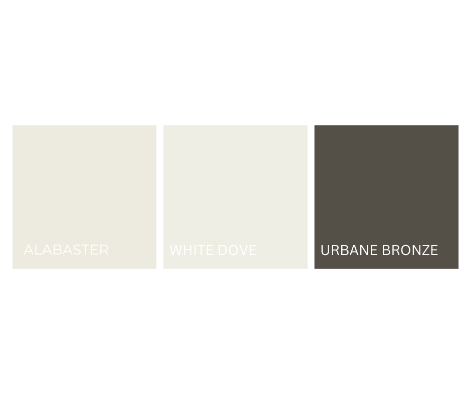
Contrasting it with Benjamin Moore’s White Dove can highlight differences, with White Dove being slightly lighter.
I’ve noticed that pairing it with warm tones, like Urbane Bronze, offers a stunning contrast.
Accents and Contrast
Alabaster’s versatility means you can add accent colors to enhance its beauty.
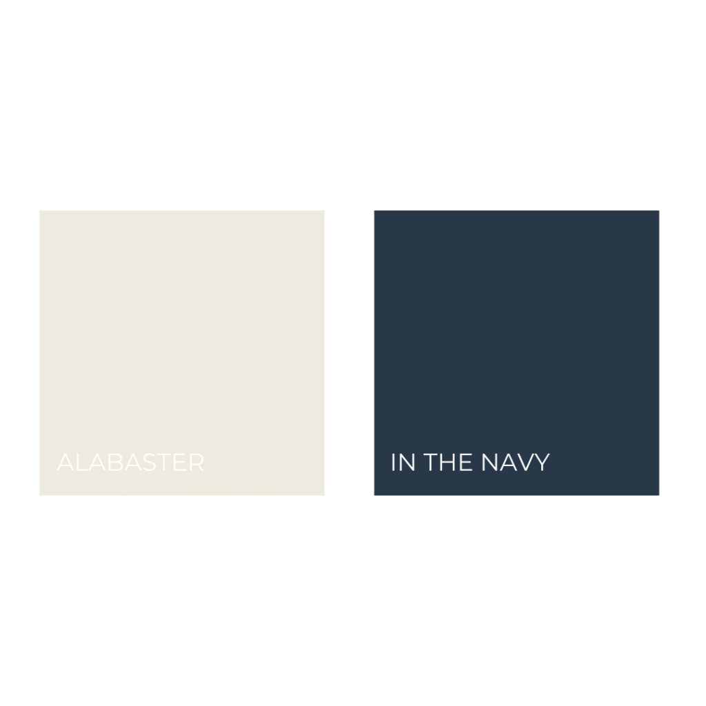
Bold colors like In The Navy or rich greens provide striking contrast and add visual interest.
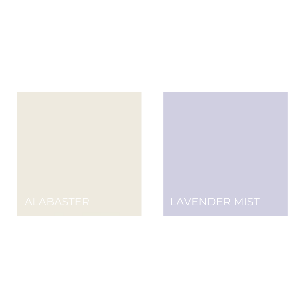
If you want a more delicate touch, shades like Lavender Mist or Cool Mint add freshness.
You can use Swiss Coffee for a calming accent, enhancing Alabaster’s creamy white quality.
This mixing of light and dark brings vibrancy and energy to a space.
Color Palettes Featuring Alabaster
For a harmonious palette, you can mix Alabaster with coordinating colors that suit your style and space.
Combine Alabaster with deeper shades like Accessible Beige for a warm and welcoming look.
My go-to is a mix of neutrals and bold accents, creating a blend that feels both inviting and dynamic.
Comparative Analysis
When deciding on the right white paint color, comparing options is crucial.
I’ve examined Sherwin Williams Alabaster against other popular shades. Understanding these differences can assist you in choosing the perfect hue for your space.
Alabaster and Other Popular Whites
In comparing Alabaster with Benjamin Moore White Dove, I notice both are favored for their warm, inviting qualities.
Alabaster has a Light Reflective Value (LRV) of 82, slightly less bright than White Dove’s 85.38. This gives Alabaster a bit more depth.
Alabaster also stands alongside Benjamin Moore Swiss Coffee and Sherwin Williams Greek Villa as versatile, warm whites.
While Swiss Coffee offers a creamy touch, Greek Villa is known for its clean finish. Each has its unique undertone, influencing the room’s ambiance.
Pros and Cons
Alabaster shines with its versatility, fitting neutral paint color schemes easily.
It pairs well with other shades, from light taupes to bold navy blues, offering a lot of design flexibility. This makes it a reliable choice for various styles and spaces.
One consideration is its warmth, which might not suit every taste if you’re seeking a stark, bright white.
Its creamy depth adds to its charm but can appear slightly dimmer in lower light environments.
Personally, I find this adds coziness and character rather than being a downside.
Customer Experiences with Alabaster
I’ve heard from numerous homeowners who praise Alabaster for its ability to create a warm and welcoming environment.
Many appreciate how it complements both traditional and modern interiors. Feedback often highlights how Alabaster pairs seamlessly with different materials and accent colors.
Some users remark that in certain lighting, Alabaster can lean towards a soft beige or cream, which may or may not align with everyone’s expectations.
Personally, I think this nuance is a delightful aspect of its complexity, making spaces feel warm and inviting.
Inspiration and Ideas
I’ve been exploring how Sherwin-Williams Alabaster can transform spaces with its warm, inviting hue.
It’s perfect for creating cozy and stylish areas, harmonizing beautifully with various decor styles and lighting conditions.
Decorating with Alabaster
When it comes to home decor, Alabaster is a versatile choice that I find works well from walls to trim.
Its slightly greige undertones pair effortlessly with both modern and traditional styles, making it a staple in many projects I’ve seen,.
I love how it acts as a perfect backdrop for artwork or vibrant textiles.
Incorporating natural lighting can enhance its warmth, making rooms feel more airy and expansive.
For those who enjoy a more neutral palette, try combining Alabaster with Great White for a crisp look that maintains the room’s warmth without becoming too stark.
Real Homes Featuring Alabaster
I’ve explored several real homes where Sherwin-Williams Alabaster truly shines.
In my own home, the soft, glowing walls illuminated by large windows make my living area feel inviting and serene.
Homeowners often use Alabaster paired with dark wooden furniture and subtle accents to create a cozy yet sophisticated space.
In another home, Alabaster was applied to kitchen cabinetry, highlighting the contrasts with dark countertops and metallic fixtures.
This mix of elements created a modern, chic kitchen that felt both fresh and homey.
The versatility of Alabaster ensures it complements almost any room, providing a seamless blend between contemporary elegance and comfortable living.
Shopping Tips
Before grabbing a gallon of Sherwin Williams Alabaster, it’s smart to consider a few factors that can impact your decision-making process.
Let’s check key steps like testing paint samples and finding the best places to purchase.
Sample Before You Buy
I always say it’s worth snagging paint samples before committing.
Alabaster is versatile but can shift in different lighting. You may have natural light in the morning but rely on lamps at night, and color can change with your light source.
Testing on your walls helps you see how it presents at different times.
Sampling gives you an edge, ensuring you love the color in real life, not just on a swatch or in photos.
Where to Purchase
Getting your hands on Sherwin Williams Alabaster is pretty straightforward.
You’ll find it at any Sherwin-Williams store, both physical and online. This makes it convenient for those who prefer browsing in person and those who love the ease of clicking a button.
Don’t overlook the big-box stores if you need paint supplies and home goods at one stop.
Many hardware stores like Lowe’s can color-match Alabaster if you can’t make it to a Sherwin-Williams store.
Buying online is also simple, with numerous delivery options if you prefer shopping from your living room.
Frequently Asked Questions
Sherwin Williams Alabaster is versatile, balancing warmth with a touch of creaminess. People often ask about its undertones and its suitability for interiors, exteriors, and pairing with other colors.
What undertones does SW Alabaster have?
Alabaster has strong yellow undertones that can vary with lighting.
In some spaces, it appears creamier, while in others, it looks more like a clean white.
Can Alabaster be used effectively for exterior painting?
Yes, it works excellently for exterior painting due to its warm and inviting tone. It offers a soft, timeless look that’s both classic and approachable.
What are some coordinating colors to pair with SW Alabaster?
It pairs wonderfully with shades like Sherwin Williams Accessible Beige, darker greiges, and navy blues, creating a balanced and cohesive palette.
What color trim complements Alabaster walls best?
For trim, I find that Sherwin Williams Pure White offers a crisp contrast, enhancing Alabaster’s warmth without overpowering it. It keeps the vibe elegant and clean.
How does Alabaster perform in a living room setting?
Alabaster works beautifully in living rooms.
It provides a warm backdrop that feels cozy yet refined, making it easy to layer with different textures and colors.
Does Alabaster paint lean more towards gray or beige?
While it leans more towards beige due to its warm undertones, it can occasionally appear slightly grayer in muted light conditions.
Its adaptability is really one of its highlights.