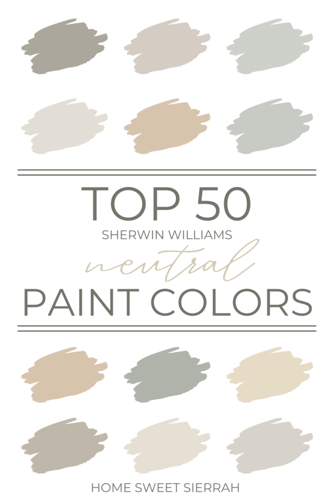
Looking for Sherwin Williams most popular neutral paint colors?
Sherwin Williams’ neutral paint colors offer endless possibilities for achieving a perfectly balanced, harmonious atmosphere in any living space.
Neutral colors have long been a popular choice for home interiors. It’s not surprising considering how they provide a versatile and timeless backdrop for so many design style.
These shades range from soft beiges, whites, and taupes to more complex grays, blacks, and greiges, each with its own unique undertones and characteristics.
Sherwin Williams’ most popular neutral colors come highly recommended for their ability to create a calming atmosphere in any space.
So whether you’re looking to create a minimalist retreat, a cozy sanctuary, or a polished and sophisticated living area, Sherwin Williams’ extensive palette of neutral paint colors offers the ideal starting point for your next project. Come with me and let’s explore them below.
This post contains affiliate links. For more information, please read my disclosure here.
Top Sherwin Williams Neutral Colors
Sherwin Williams has a wide array of neutral colors that cater to various tastes.
From calming grays to warm beiges, these versatile shades provide a perfect backdrop for any interior design style.
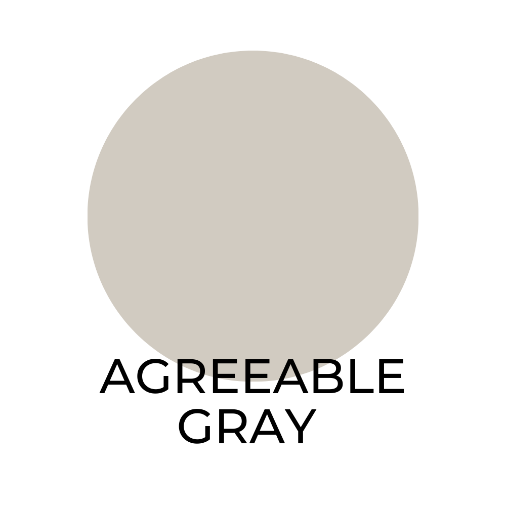
Agreeable Gray SW 7029 / LRV 60
a popular choice among homeowners due to its warm and inviting effect. This versatile shade can adapt to both small and large spaces. For a harmonious combination consider pairing Agreeable Gray with:
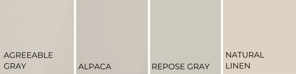
- Alpaca SW 7022
- Repose Gray SW 7015
- Natural Linen SW 9109
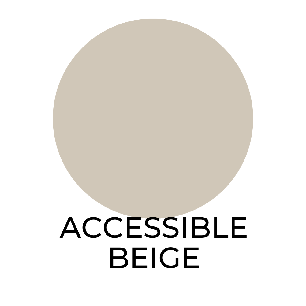
Accessible Beige SW 7036 / LRV 58
This neutral beige shade works well with a variety of complementary colors such as:
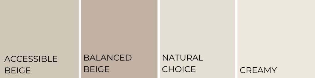
- Balanced Beige SW 7037
- Natural Choice SW 7011
- Creamy SW 7012
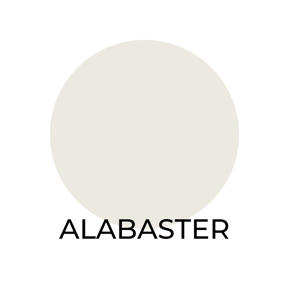
Alabaster SW 7008 / LRV 82
A popular off-white choice. This bright and clean color pairs well with:
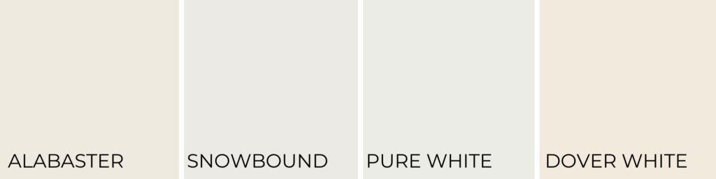
- Snowbound SW 7004
- Pure White SW 7005
- Dover White SW 6385
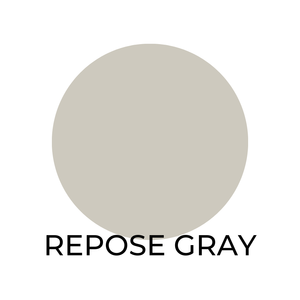
Repose Gray SW 7015 / LRV 58
For those who prefer cooler tones this color offers a soothing atmosphere. This calming gray is easily complemented by:
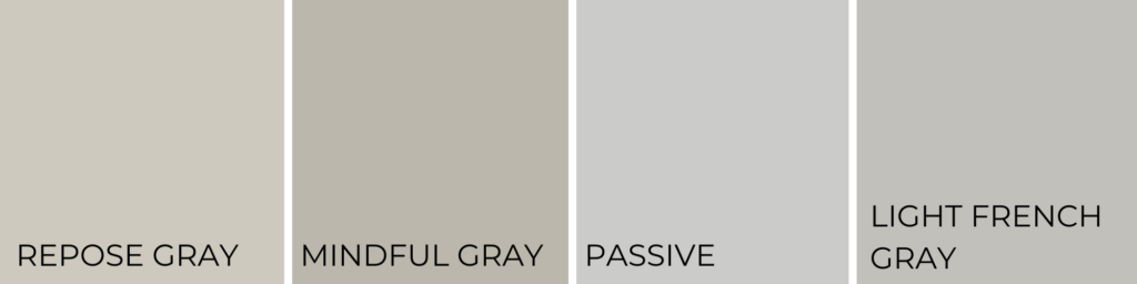
- Mindful Gray SW 7016
- Passive SW 7064
- Light French Gray SW 0055

Gray Screen SW 7071 / LRV 59
For those who prefer cooler tones this is a nice pale gray. This elegant color works well with:
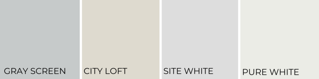
- City Loft SW 7631
- Site White SW 7070
- Pure White SW 7005
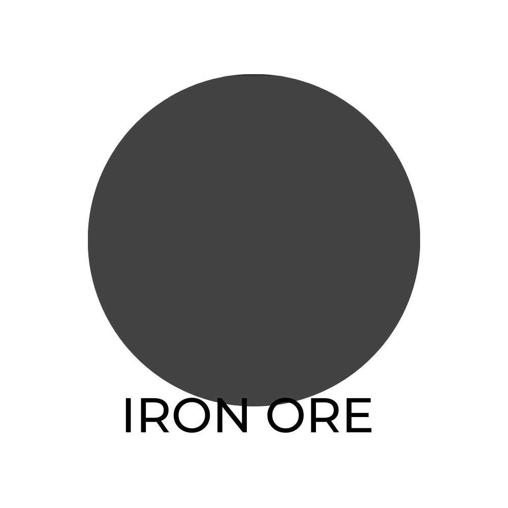
Iron Ore SW 7069 / LRV 6
This is a more bold neutral choice. This dark shade makes a statement, especially when paired with other neutrals like:
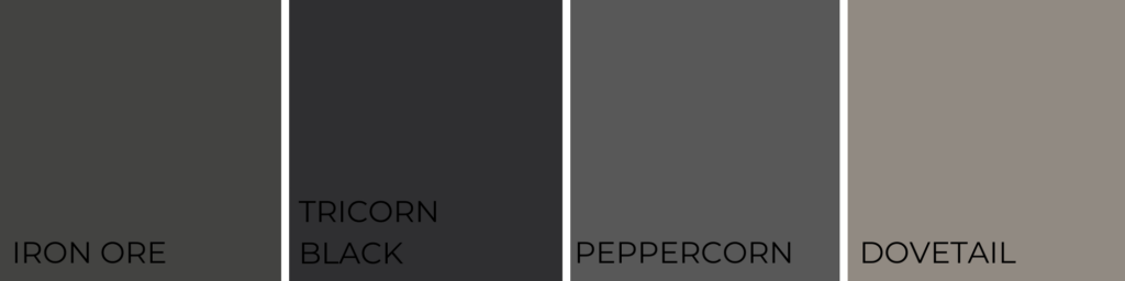
- Tricorn Black SW 6258
- Peppercorn SW 7674
- Dovetail SW 7018
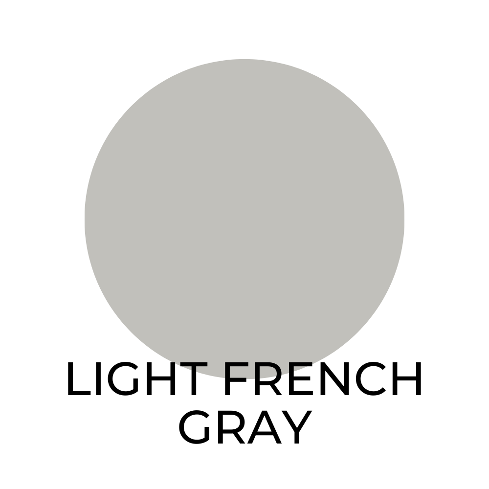
Light French Gray SW 0055 / LRV 53
A classic gray with a slightly cool undertone. Harmonizes with these colors:
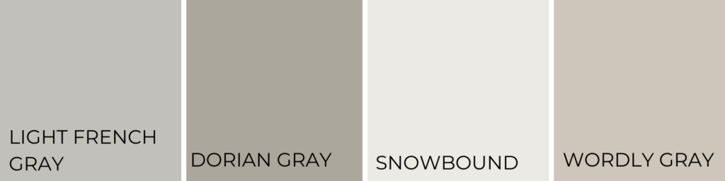
- Dorian Gray SW 7017
- Snowbound SW 7004
- Worldly Gray SW 7043

Snowbound SW 7004 / LRV 83
A crisp white with slight gray undertones, looks great alongside:

- Iron Ore SW 7069
- Extra White SW 7006
- Repose Gray SW 7015
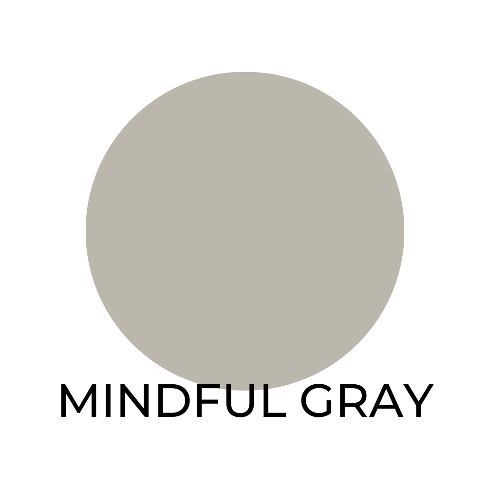
Mindful Gray SW 7016 / LRV 58
A balanced gray with a touch of warmth. This color works well with:
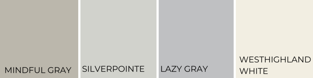
- Silverpointe SW 7653
- Lazy Gray SW 6254
- Westhighland White SW 7566

Creamy SW 7012 / LRV 63
Creamy is a warm, inviting paint color that creates a cozy atmosphere in any room. It pairs well with:
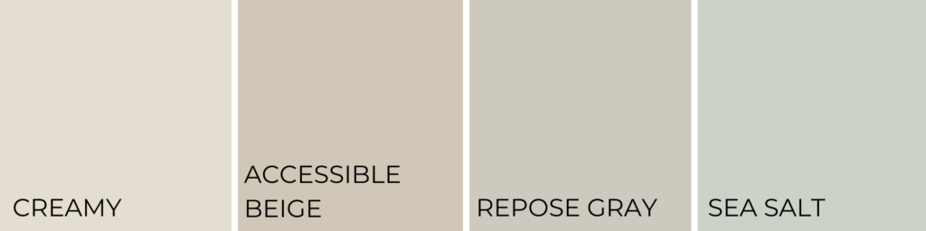
- Accessible Beige SW 7036
- Repose Gray SW 7015
- Sea Salt SW 6204.
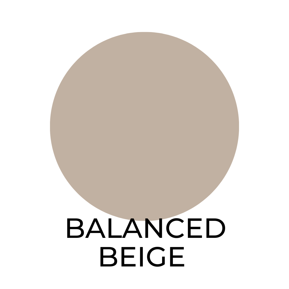
Balanced Beige SW 7037 / LRV 46
This versatile, warm beige paint color has a subtle undertone of gray. It is a great choice for creating a calm, soothing atmosphere in a room and pairs well with:
- Alabaster SW 7008
- Agreeable Gray SW 7029
- Dorian Gray SW 7017
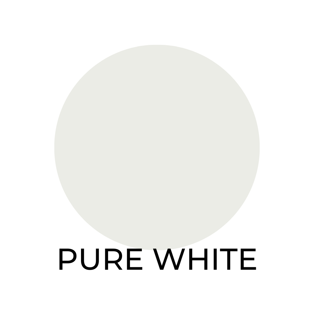
Pure White SW 7005 / LRV 84
This bright, clean white paint color is perfect for creating a modern, minimalist look. It pairs well with:

- Extra White SW 7006
- Mindful Gray SW 7016
- Urbane Bronze SW 7048
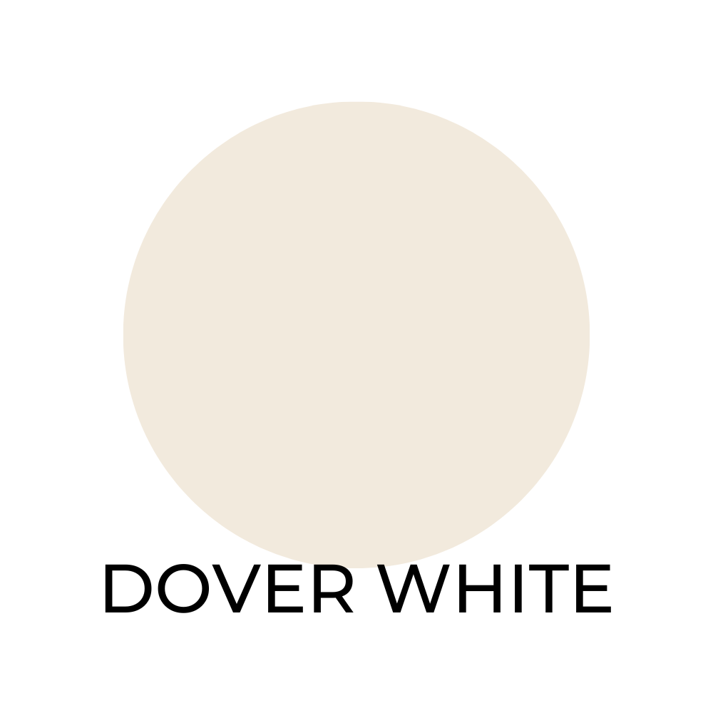
Dover White SW 6385 / LRV 76
This warm, creamy white paint color has a subtle yellow undertone. It is a great choice for creating a cozy, inviting atmosphere in a room and pairs well with:
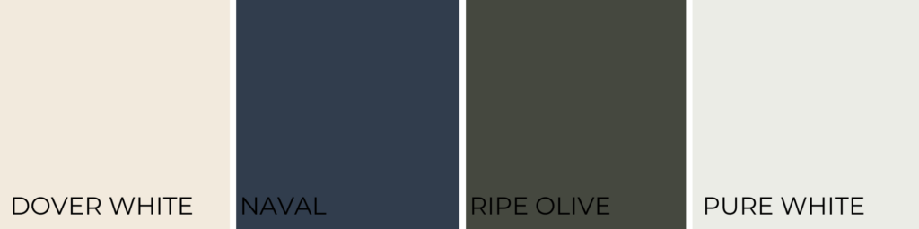
- Naval SW 6244
- Ripe Olive SW 6209
- Pure White SW 7005

Tricorn Black SW 6258 / LRV 3
A deep, dramatic black paint color that adds a touch of sophistication to any room. It pairs well with:
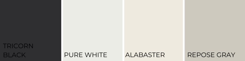
- Pure White SW 7005
- Alabaster SW 7008
- Repose Gray SW 7015
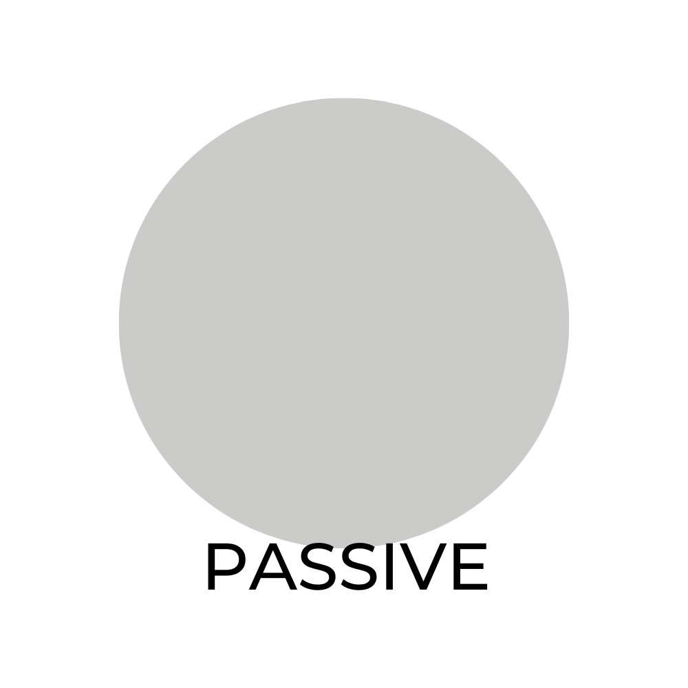
Passive SW 7064 / LRV 60
Passive is a soft, muted gray paint color that creates a calming atmosphere in any room. It pairs well with warm wood tones and natural materials like:

- Pure White SW 7005
- Alabaster SW 7008
- Dorian Gray SW 7017
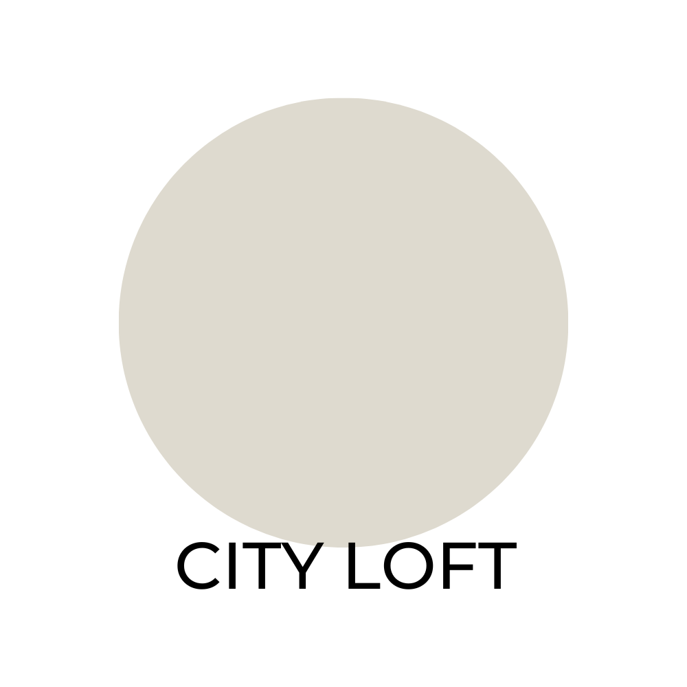
City Loft SW 7631 / LRV 61
City loft is a warm, light gray paint color that has a subtle brown undertone. It is a great choice for creating a cozy, inviting atmosphere in a room and pairs well with earthy tones like:

- Pure White SW 7005
- Alabaster SW 7008
- Repose Gray SW 7015
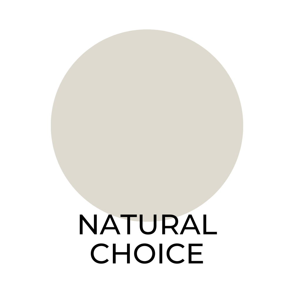
Natural Choice SW 7011 / LRV 75
This warm, creamy white paint color is perfect for creating a classic, timeless look. It pairs well with both warm and cool colors like:
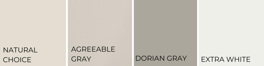
- Agreeable Gray SW 7029
- Dorian Gray SW 7017
- Extra White SW 7006
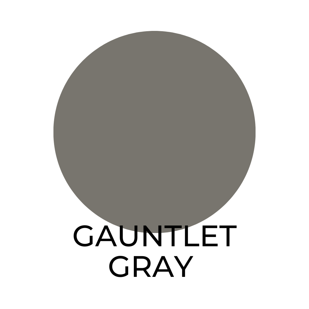
Gauntlet Gray SW 7019 / LRV 29
This deep, dark gray paint color adds a touch of drama to any room. It pairs well with bold, bright colors and also complements neutral shades like gray and beige. Consider using it along with:
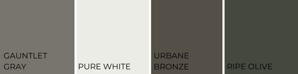
- Pure White SW 7005
- Urbane Bronze SW 7048
- Ripe Olive SW 6209
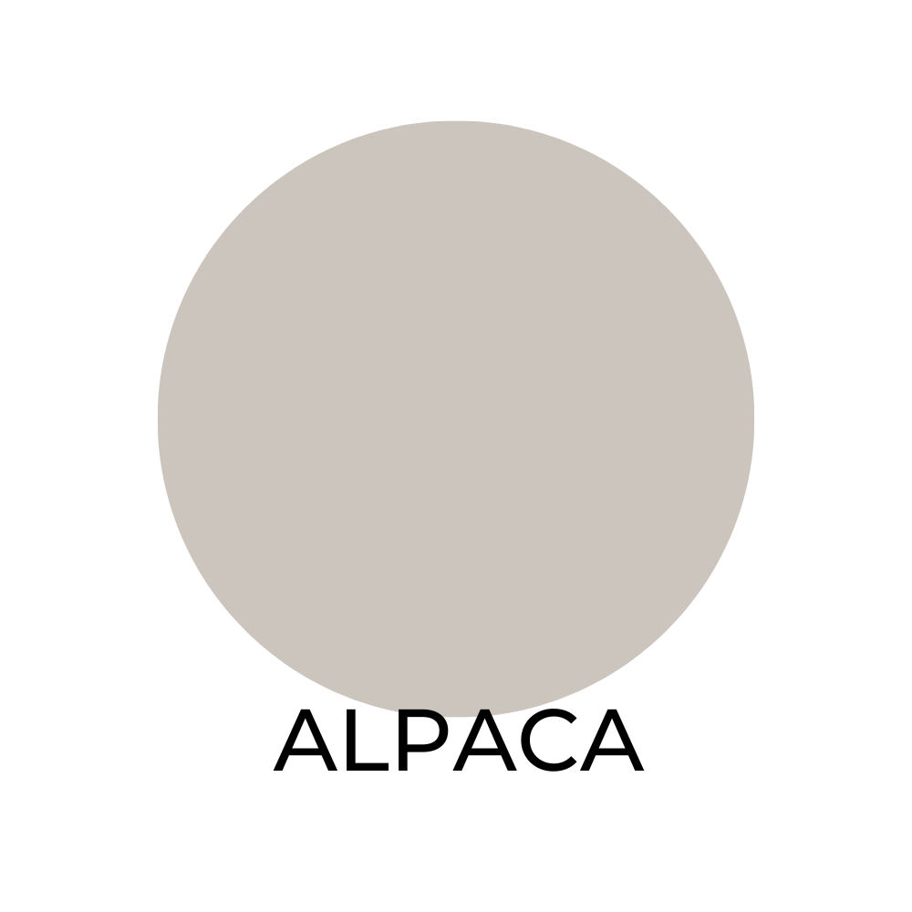
Alpaca SW 7022 / LRV 56
Alpaca is warm, neutral paint color that has a subtle undertone of brown. It is a great choice for creating a cozy, inviting atmosphere in a room and pairs well with:

- Pure White SW 7005
- Repose Gray SW 7015
- Naval SW 6244

Natural Linen SW 9109 / LRV 64
This warm, creamy beige paint color has a subtle yellow undertone. It is a great choice for creating a cozy, inviting atmosphere in a room and pairs well with:
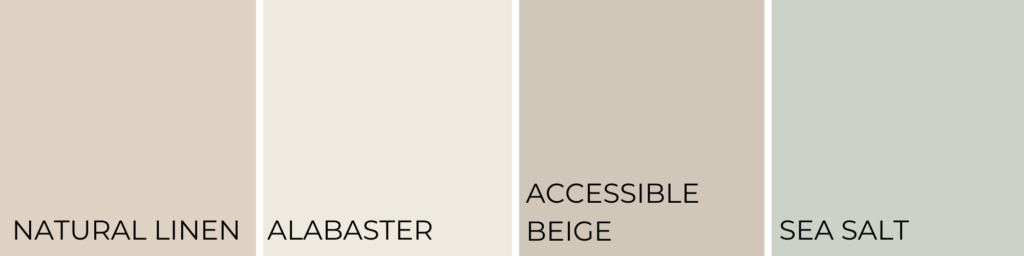
- Alabaster SW 7008
- Accessible Beige SW 7036
- Sea Salt SW 6204
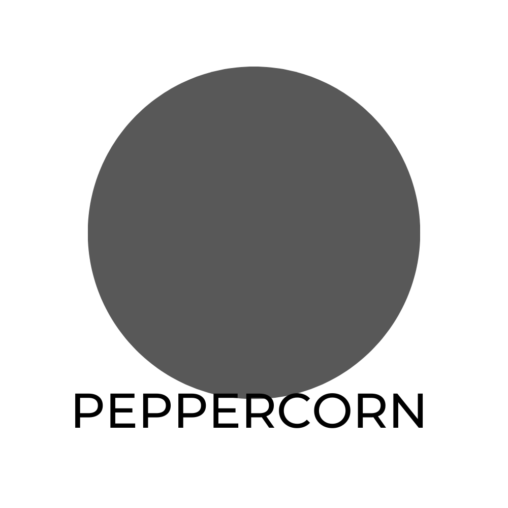
Peppercorn SW 7674 / LRV 12
This deep, rich black has a low light reflectance value. It pairs well with:

- Alabaster SW 7008
- Anew Gray SW 7030
- Extra White SW 7006
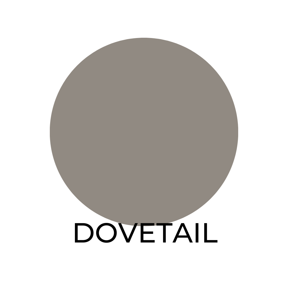
Dovetail SW 7018 / LRV 26
Dovetail is a medium to dark gray with a moderate light reflectance value. Dovetail looks great in a room with:
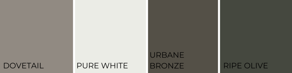
- Pure White SW 7005
- Urbane Bronze SW 7048
- Ripe Olive SW 6209
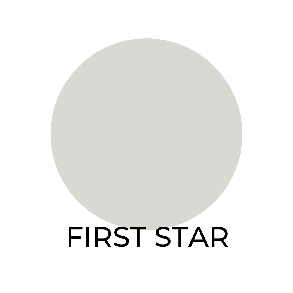
First Star SW 7646 / LRV 69
This bright light gray pairs well with:

- Extra White SW 7006
- Ellie Gray SW 7650
- Deep Forest Brown SW 9175
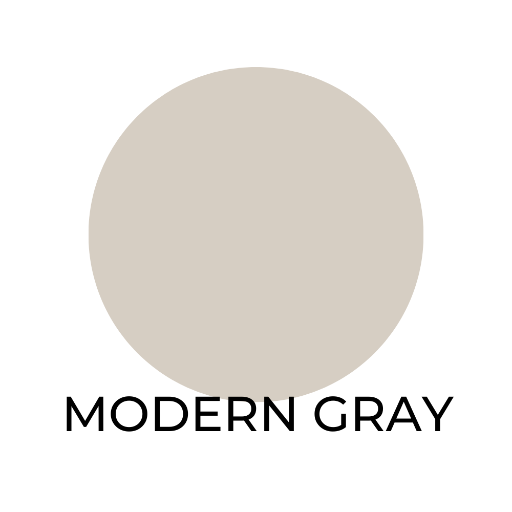
Modern Gray SW 7632 / LRV 62
This soft warm gray is complimented by:

- Snowbound SW 7004
- Taupe Tone SW 7633
- Plum Dandy SW 6284
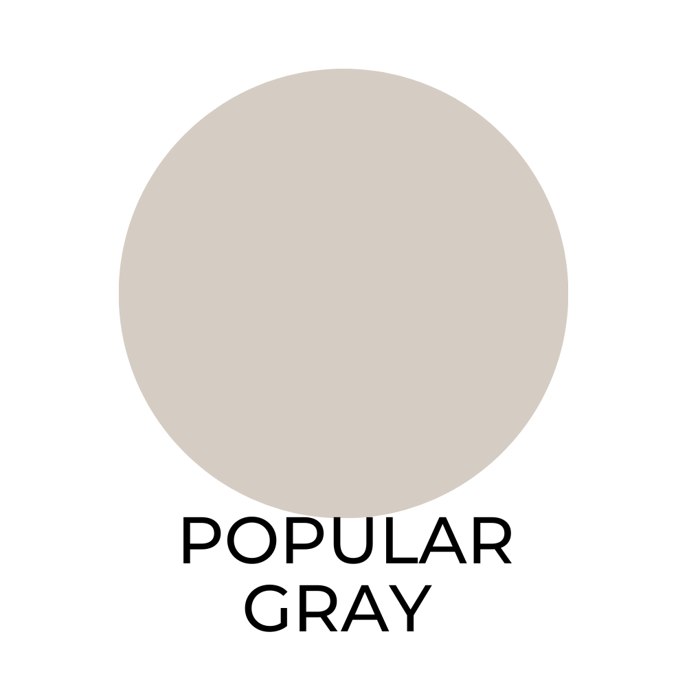
Popular Gray SW 6071 / LRV 61
This soft and subtle gray looks even better beside:
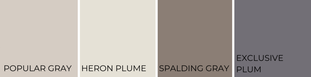
- Heron Plume SW 6070
- Spalding Gray SW 6074
- Exclusive Plum SW 6263
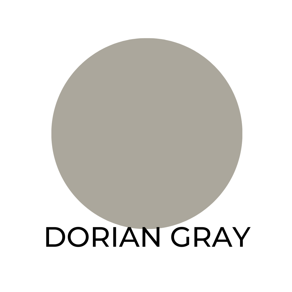
Dorian Gray SW 7017 / LRV 39
This medium gray with a moderate light reflectance value looks great when use along side:
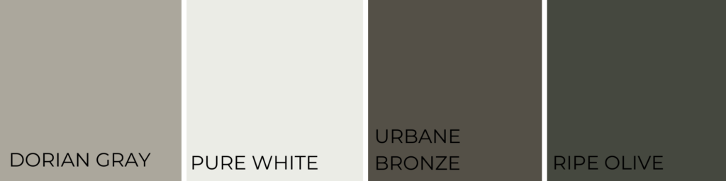
- Pure White SW 7005
- Urbane Bronze SW 7048
- Ripe Olive SW 6209
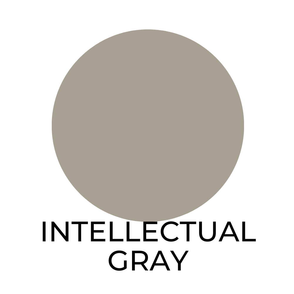
Intellectual Gray SW 7045 / LRV 42
Intellectual Gray is a versatile and sophisticated color that pairs well with:

- Pure White SW 7005
- Extra White SW 7006
- Urbane Bronze SW 7048.
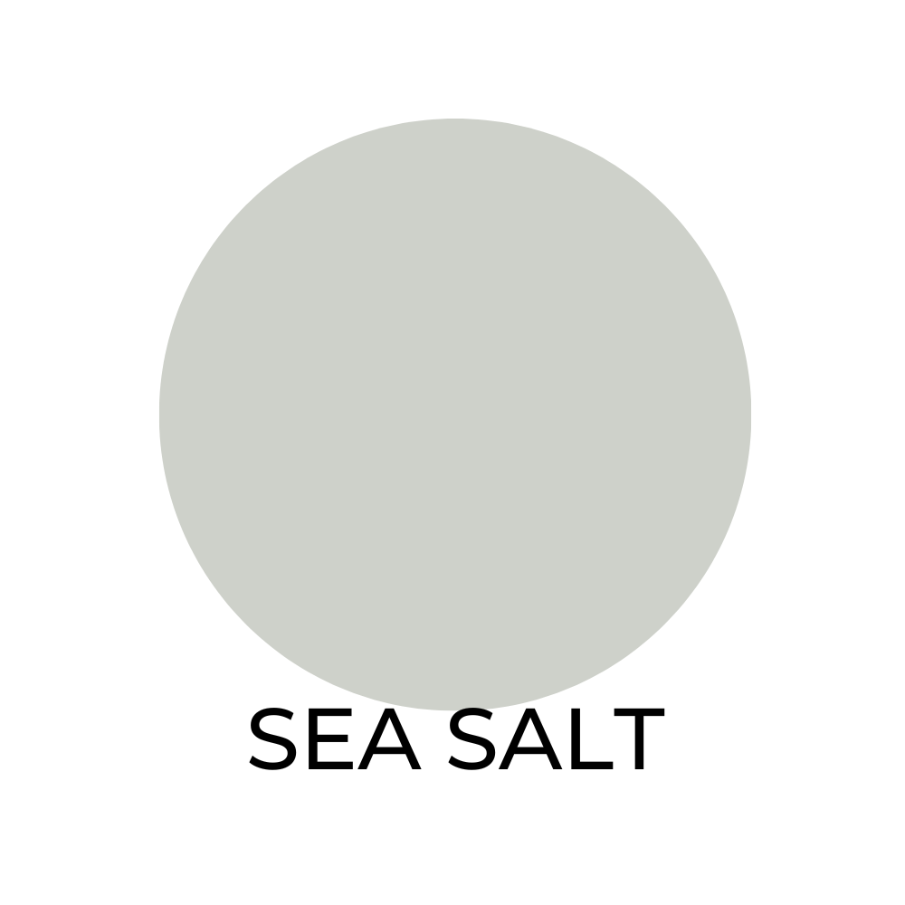
Sea Salt SW 6204 / LRV 64
Sea Salt is a calming and soothing color that pairs well with:
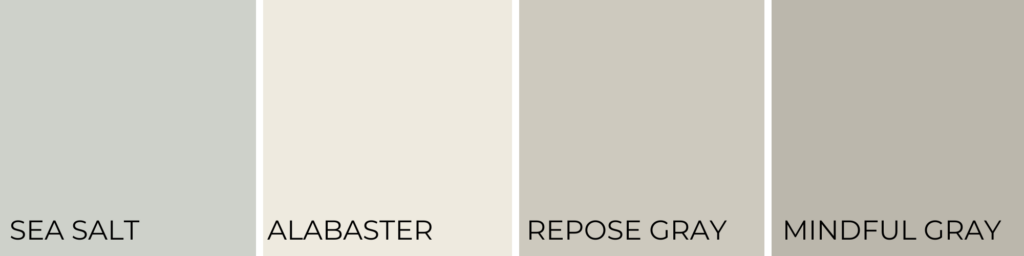
- Alabaster SW 7008
- Repose Gray SW 7015
- Mindful Gray SW 7016.
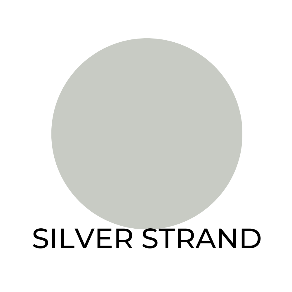
Silver Strand SW 7057 / LRV 63
This cool and refreshing color pairs well with:

- Pure White SW 7005
- Alabaster SW 7008
- Dorian Gray SW 7017
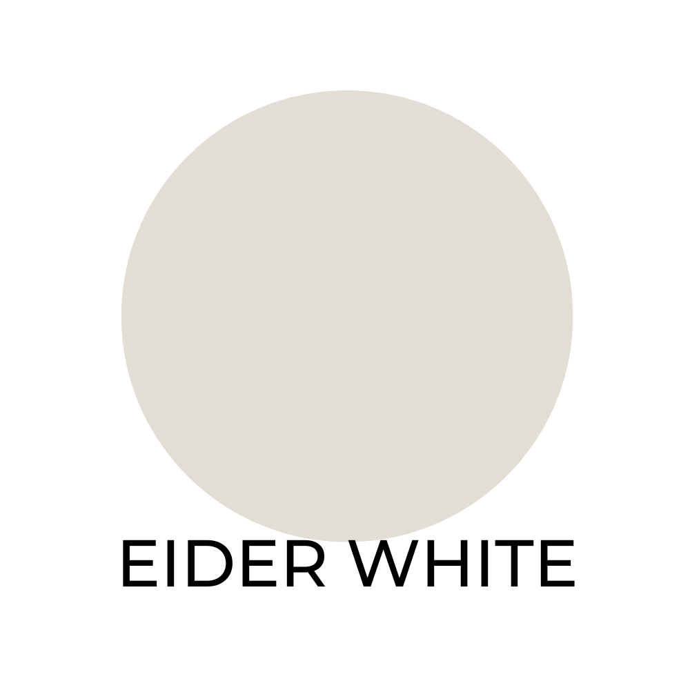
Eider White SW 7014 / LRV 73
A warm and inviting color that is complimented by:

- Repose Gray SW 7015
- Sea Salt SW 6204
- Naval SW 6244
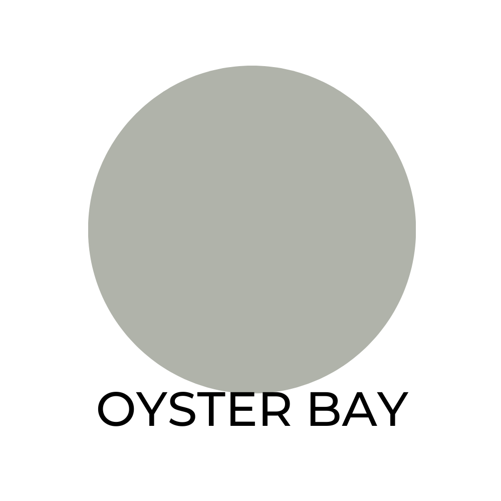
Oyster Bay SW 6206 / LRV 44
A deep and moody color that pairs well with:
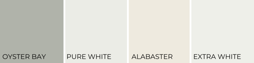
- Pure White SW 7005
- Alabaster SW 7008
- Extra White SW 7006
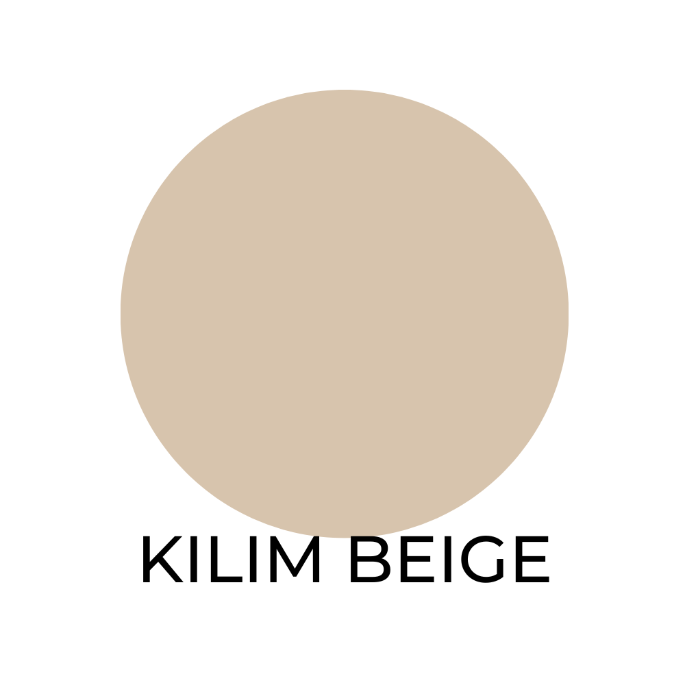
Kilim Beige SW 6106 / LRV 56
Kilim Beige is a warm and inviting, popular neutral color that pairs well with:
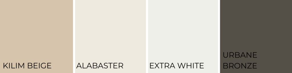
- Alabaster SW 7008
- Extra White SW 7006
- Urbane Bronze SW 7048.
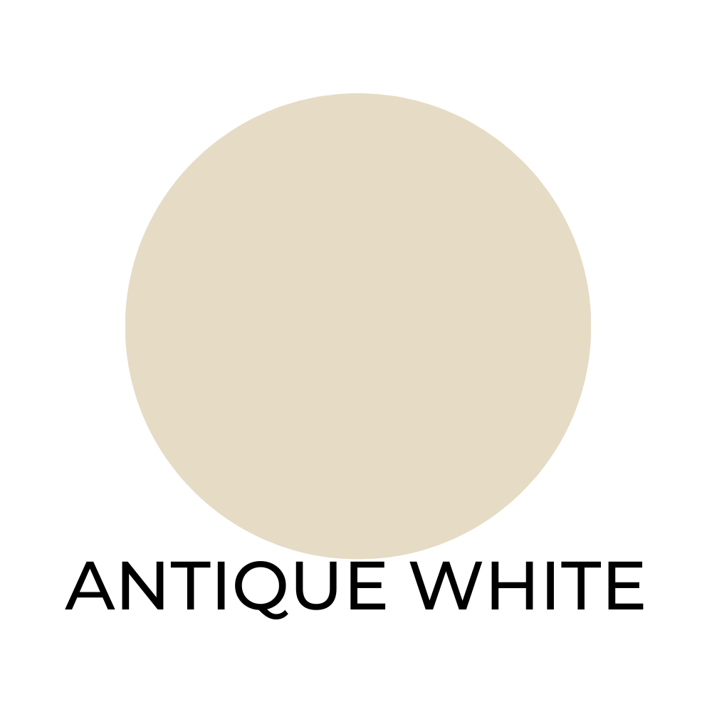
Antique White SW 6119 / LRV 78
This classic and timeless color looks great with:
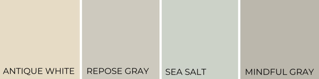
- Repose Gray SW 701
- Sea Salt SW 6204
- Mindful Gray SW 7016

Anew Gray SW 7030 / LRV 47
This versatile and modern neutral color pairs well with:

- Pure White SW 7005
- Dorian Gray SW 7017
- Urbane Bronze SW 7048
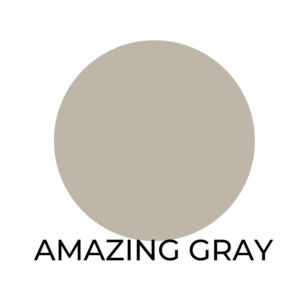
Amazing Gray SW 7044 / LRV 48
A cool and sophisticated color that pairs well with:
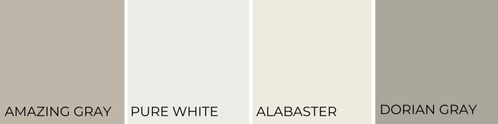
- Pure White SW 7005
- Alabaster SW 7008
- Dorian Gray SW 7017
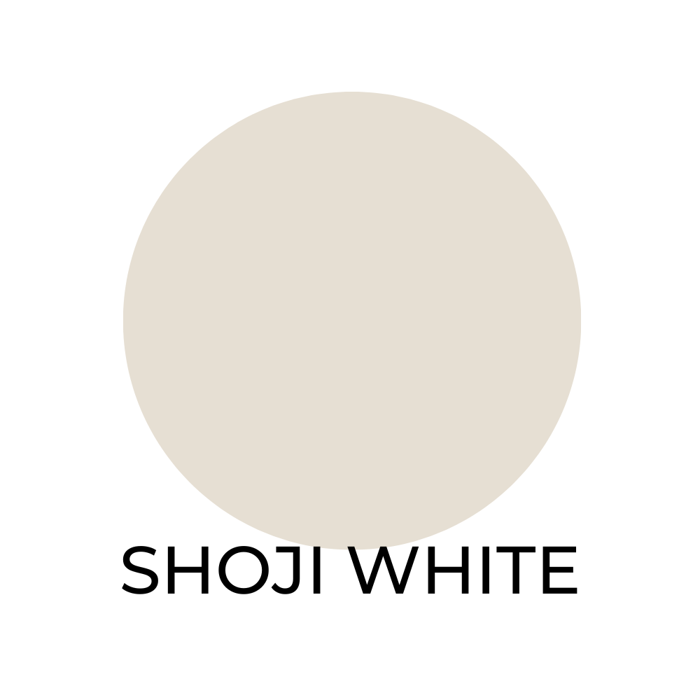
Shoji White SW 7042 / LRV 73
This soft and serene color look good when used with:

- Pure White SW 7005
- Alabaster SW 7008
- Repose Gray SW 7015
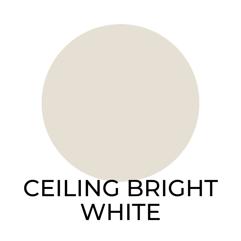
Ceiling Bright White SW 7007 / LRV 85
This crisp and clean color pairs well with:

- Extra White SW 7006
- Pure White SW 7005
- Alabaster SW 7008
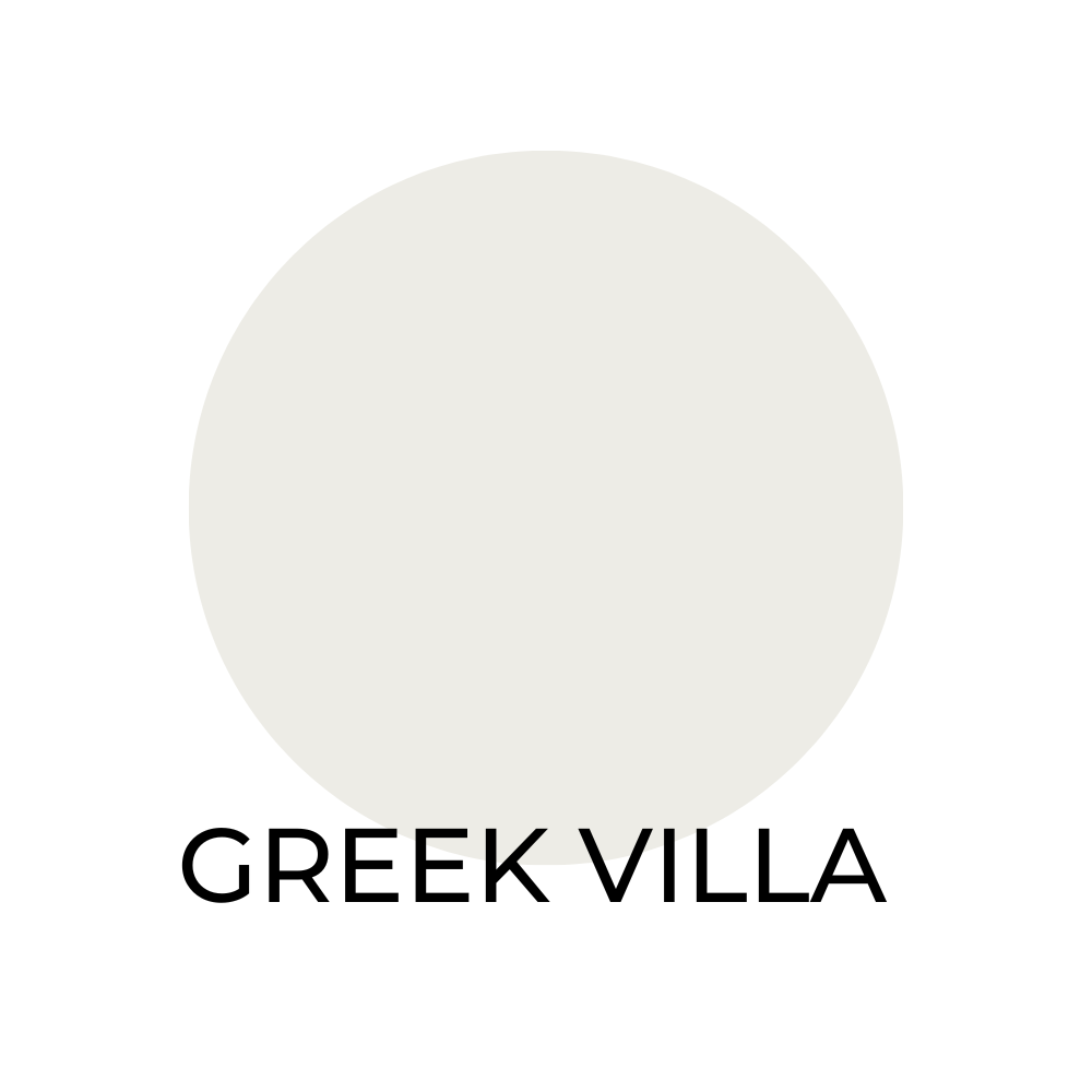
Greek Villa SW 7551/ LRV 74
This fresh and airy color that compliments:
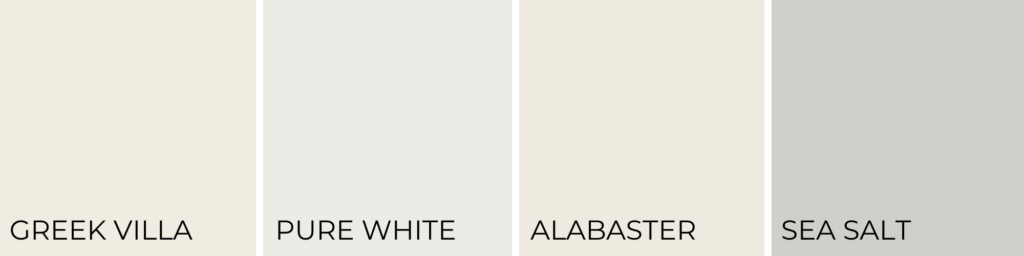
- Pure White SW 7005
- Alabaster SW 7008
- Sea Salt SW 6204

Aesthetic White SW 7035 / LRV 73
Aesthetic White is a soft and warm neutral color that looks good when paired with:

- Pure White SW 7005
- Repose Gray SW 7015
- Urbane Bronze SW 7048
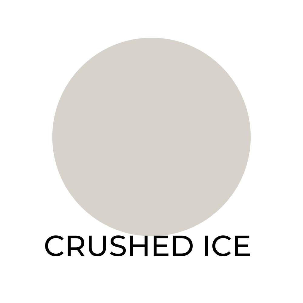
Crushed Ice SW 7647 / LRV 68
This is a cool and refreshing color that looks good when paired with:

- Pure White SW 7005
- Alabaster SW 7008
- Dorian Gray SW 7017

Pearly White SW 7009 / LRV 78
This classic and timeless color is complimented by:
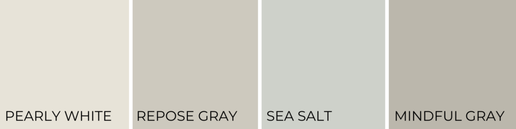
- Repose Gray SW 7015
- Sea Salt SW 6204
- Mindful Gray SW 7016
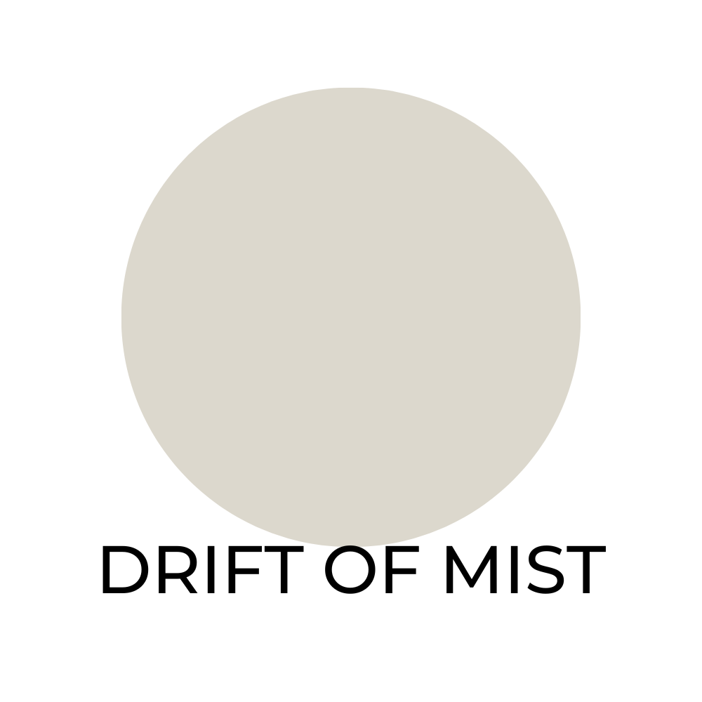
Drift of Mist SW 9166 / LRV 68
A soft and serene color that looks good when paired with:

- Pure White SW 7005
- Alabaster SW 7008
- Naval SW 6244
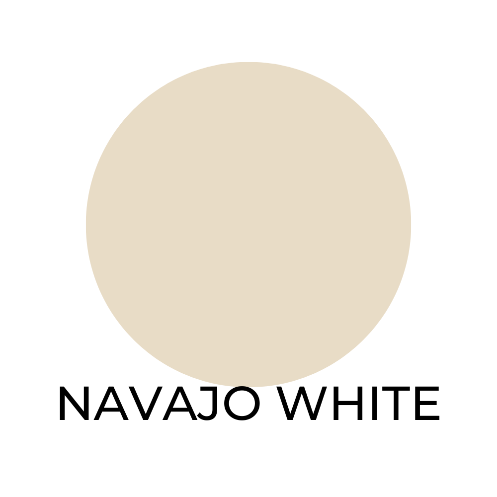
Navajo White SW 6126 / LRV 68
Navajo White is a warm and inviting color that looks good when paired with:
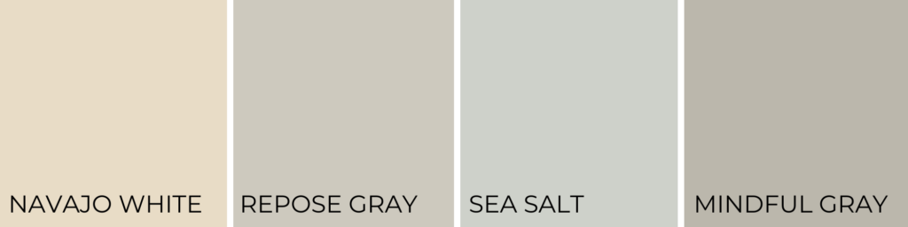
- Repose Gray SW 7015
- Sea Salt SW 6204
- Mindful Gray SW 7016

On The Rocks SW 7671 / LRV 59
This cool and sophisticated neutral looks good with:

- Pure White SW 7005
- Alabaster SW 7008
- Dorian Gray SW 7017
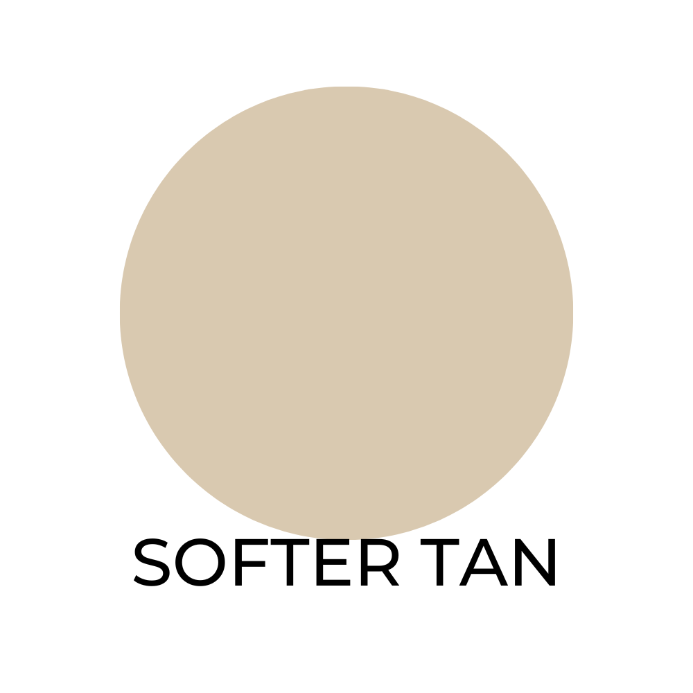
Softer Tan SW 6141 / LRV 55
This warm and cozy color that looks great next to:

- Extra White SW 7006
- Pure White SW 7005
- Alabaster SW 7008
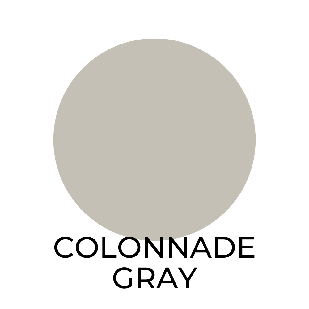
Colonnade Gray SW 7641 / LRV 53
A modern and versatile color, frequently used along side:
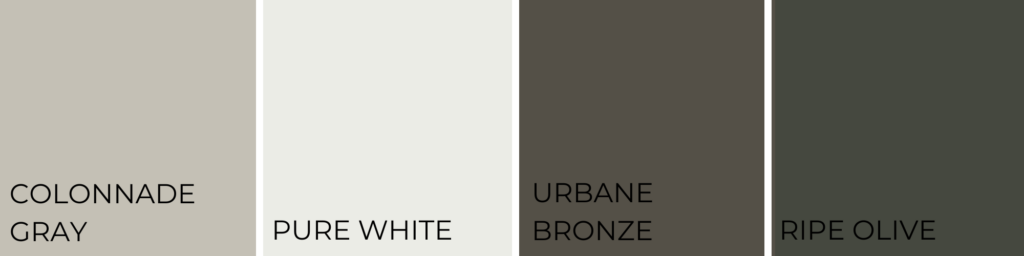
- Pure White SW 7005
- Urbane Bronze SW 7048
- Ripe Olive SW 6209
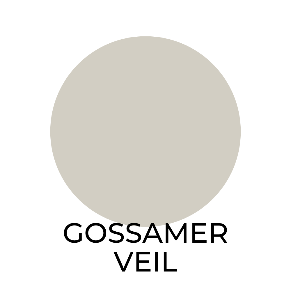
Gossamer Veil SW 9165 / LRV 70
This light and airy color pair nicely with:

- Pure White SW 7005
- Alabaster SW 7008
- Repose Gray SW 7015
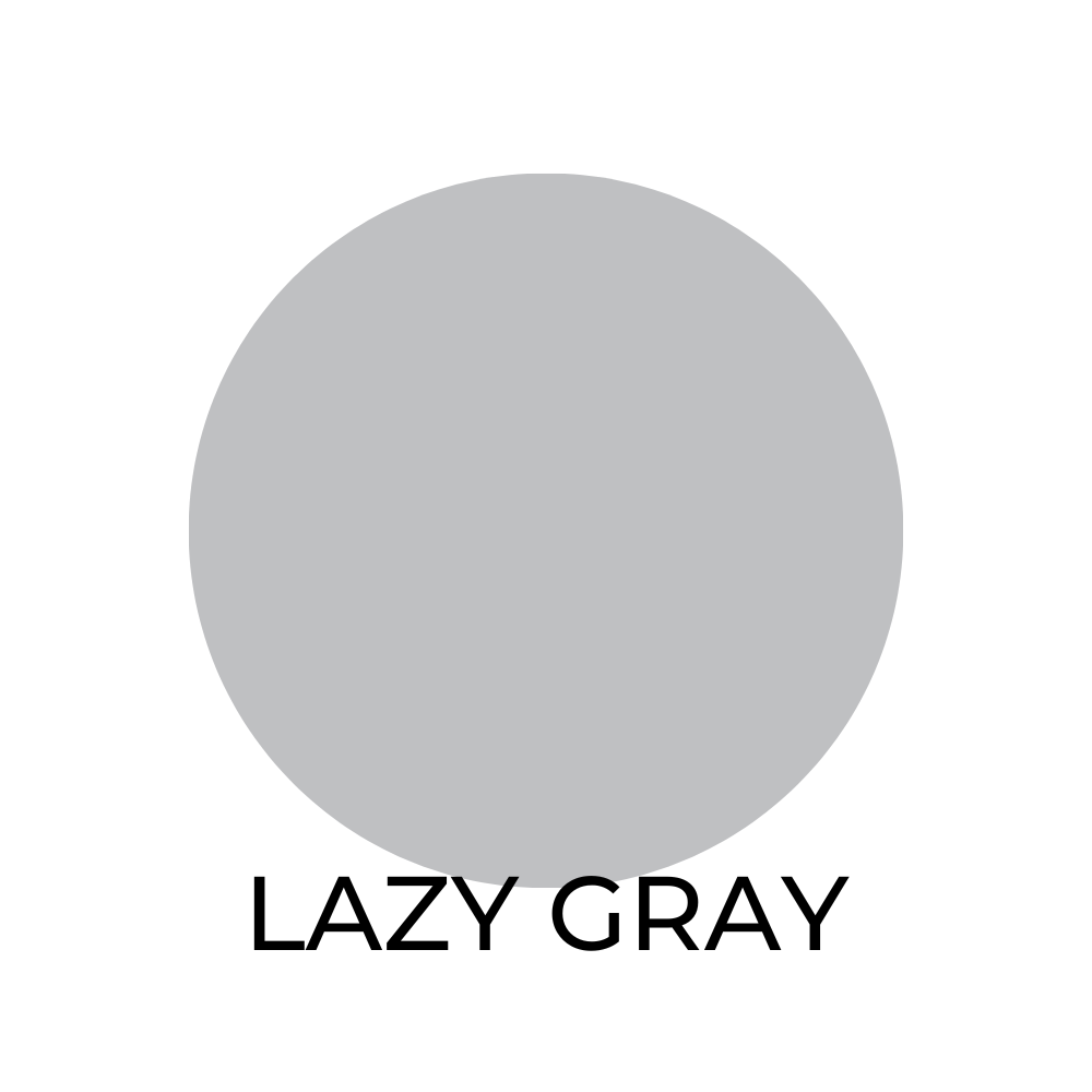
Lazy Gray SW 6254 / LRV 49
A cool and calming color that looks good when paired with:
- Pure White SW 7005
- Alabaster SW 7008
- Dorian Gray SW 7017
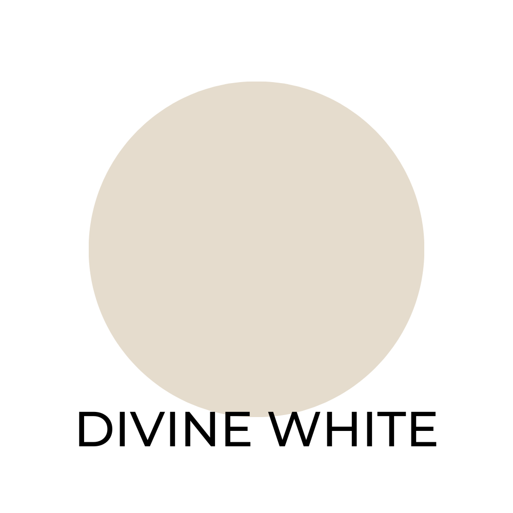
Divine White SW 6105 / LRV 76
This is warm and inviting neutral paint color that looks great when paired with:
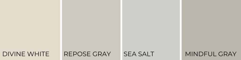
- Repose Gray SW 7015
- Sea Salt SW 6204
- Mindful Gray SW 7016
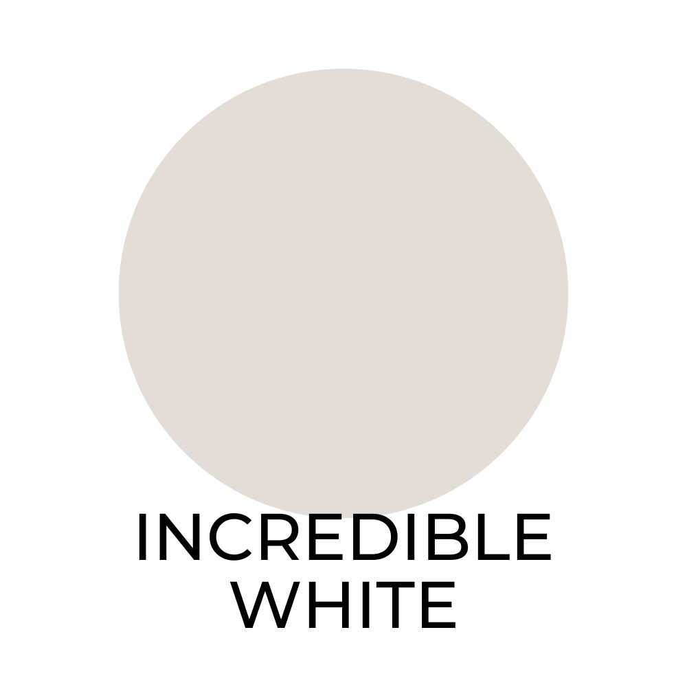
Incredible White SW 7028 / LRV 83
Incredible White is a fresh and bright color, consider pairing it with:
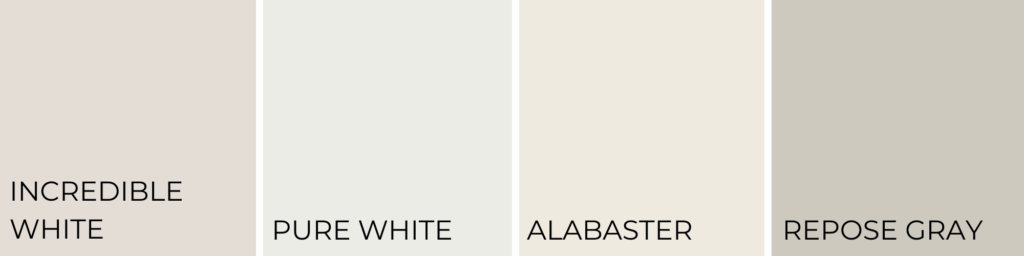
- Pure White SW 7005
- Alabaster SW 7008
- Repose Gray SW 7015
To ensure the best results, it’s always a good idea to order samples to see how the colors will look.
With so many neutral options from Sherwin Williams, you’re sure to find the perfect shade to create a timeless space in your home.
Understanding Undertones
When selecting the best Sherwin Williams neutral paint colors, you want to consider the undertones present in each shade.
Undertones are the subtle colors that lie beneath the surface of a paint color. They add depth and nuance to the overall hue. In neutral colors, undertones can be red, blue, green, or yellow.
A warm undertone tends to be associated with colors like red, orange, and yellow.
These warm undertones will give a cozy feeling to your space.
On the other hand, cool undertones like blue and green can bring a sense of calm to a room.
Understanding these undertones can greatly influence the atmosphere you create in your interior.
If you’re searching for a warm and inviting neutral, look for shades with red or yellow undertones.
If you prefer a more calming space, opt for neutrals with blue or green undertones.
To effectively see the undertones of a paint color, comparing it to a pure white swatch can be helpful.
By doing so, the subtle differences in the undertones will be easier to discern.
I also like to place paint samples near materials and furnishings in a room. This helps visualize how well they complement existing décor.
Finding the Right Balance
Incorporating the most popular Sherwin Williams neutral colors into your home can create a well-balanced, modern, and stylish atmosphere.
These colors are versatile and easily pair with a wide array of other hues and materials, allowing homeowners to effortlessly personalize their spaces.
Neutral paint colors help establish a soothing and harmonious foundation in a room.
They allow homeowners to play with different design elements and accentuate specific aspects of their style.
Using a neutral base gives you the freedom to incorporate various textures, patterns, and colors without overwhelming the overall aesthetic.
For a modern touch, consider blending neutrals like Repose Gray SW 7015 or Pure White SW 7005 with bold pops of color.
This combination adds visual interest and brings your design to life, while maintaining a sense of balance and cohesion.
Mixing light and dark neutrals, like pairing Iron Ore SW 7069 with White Duck SW 7010, can create depth and elevate the elegance of a room.
Choosing the right Sherwin Williams neutral colors can make all the difference in achieving the perfect balance for your home.
Be sure to consider undertones and how each shade will work with your preferred style.
By doing so, you’ll create a timeless, comfortable, and friendly space that truly reflects your unique personality.
Creating a Cohesive Color Scheme
Creating a cohesive color scheme for your home will bring a sense of sophistication to your living spaces.
Neutral colors have always been my favorite and are an excellent choice for achieving this effect. They blend seamlessly with so many various styles.
Sherwin Williams offers a wide range of neutral colors that can help you build a quiet, harmonious environment.
When choosing colors, please start by obtaining paint samples.
These will help you visualize how different shades will look in your space, considering the lighting and existing furniture. They have saved me from choosing the wrong color so many times.
Don’t be afraid to mix and match different neutrals to create a balanced composition.
The key is to maintain a consistent undertone throughout your home, so the colors flow from room to room.
While choosing the perfect color scheme, consider the mood you want to establish in your home.
Do you prefer a soothing environment. Or would you like to create a warm and welcoming space?
The right palette is crucial in setting the atmosphere, so it’s worth taking some time to research before you decide. Trust me.
Matching Neutrals with Lighting and Furniture
When I’m designing a room with neutral colors, I always consider the lighting and furniture to create a well-balanced space.
Sherwin Williams neutral colors create a warm atmosphere that complements various furniture, materials, textures, and décor elements.
Consider Lighting Before Choosing Neutral Paint Colors
One factor to ponder over is the lighting in the room.
Natural light greatly affects the appearance of colors, making them seem warmer or cooler.
In spaces with abundant natural light, cooler neutrals like Homburg Gray (SW 7622) or Mineral Deposit (SW 7652) can help balance the warmth of the sunlight.
In rooms with limited natural light, warmer neutrals such as Alabaster (SW 7008) or Fawn Brindle (SW 7640) can make the space feel cozier and brighter.
Consider Furniture Before Choosing Neutral Paint Colors
When selecting furniture, I recommend you consider the materials and textures to create a cohesive design.
Wood finishes work well with warm neutrals, like Versatile Gray (SW-6072). On the other hand cooler neutrals, such as Guild Grey (SW 9547), pair nicely with metallic or glass accents.
Incorporating different textures in upholstery, rugs, and pillows will add depth to the room and complete the look.
So take these elements into account to create your harmonious space with Sherwin Williams neutral paint colors!
Incorporating Neutrals in Various Spaces
Neutral colors can effortlessly be incorporated into various spaces in your home. They enhance the aesthetics while creating an inviting atmosphere.
These hues are versatile and complement a wide range of other colors.
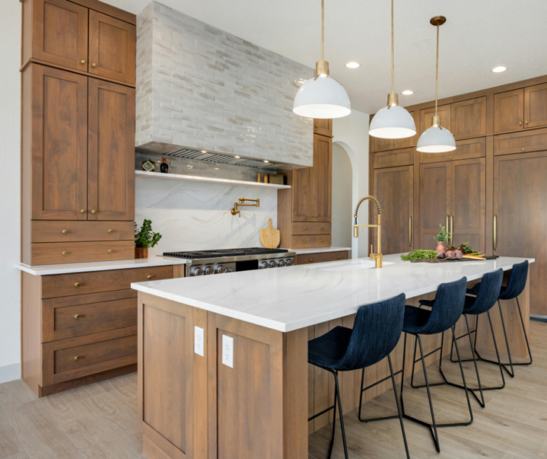
When it comes to your kitchen cabinets, consider the timeless allure of a warm greige shade.
This neutral color offers a perfect balance between gray and beige. I love using it to create a sophisticated yet cozy kitchen space.
Greige is also a fantastic option for other furniture pieces. It enhances the room’s overall ambiance without overwhelming the design elements.
For those looking to add depth and drama to a space without straying too far from neutral colors, a charcoal gray is an excellent choice.
This deep, moody tone provides a rich backdrop for artwork, furniture, and other accent pieces.
It can be particularly striking in living rooms, bedrooms, or even dining spaces where you want to evoke a sense of elegance and luxury.
Another great option for adding depth to your home is naval, which is a dark, bold shade of blue with a chilling undertone.
This dashing color can create a chic, seamless look when paired with light fixtures, hardware, and other metallic accents.
Naval is excellent for use on accent walls or in spaces where you want to create a calm atmosphere, such as bedrooms, home offices, or bathrooms.
Whether you’re going for a warm and comforting vibe or a sleek, sophisticated look, there’s a Sherwin Williams neutral color for every design preference and requirement.
Ordering Samples and Starting Your Project
Sherwin Williams offers a wide range of neutral colors that are both versatile and stylish.
With over 50 top neutral hues, this brand has a selection that will provide comfort and inspire creativity in any space.
To ensure the perfect match for your project, it’s a great idea to order samples before committing to a specific color.
Once the samples have been received, take the time to test them in the space where the paint will be applied.
Don’t forget to pin this post to Pinterest so you don’t lose your favorite Sherwin Williams neutral colors.