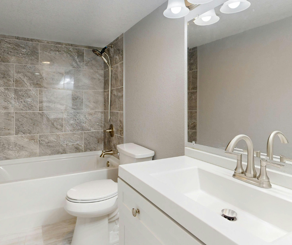
If you’re trying to pick a paint color for a small bathroom, I promise you’re not overthinking it…the color you choose really does make a difference.
A small bathroom can either feel clean, bright, and intentional or cramped, dark, and awkward.
And the good news? You don’t need to knock down walls or do a full renovation to fix it.
The right paint color can completely transform the space.
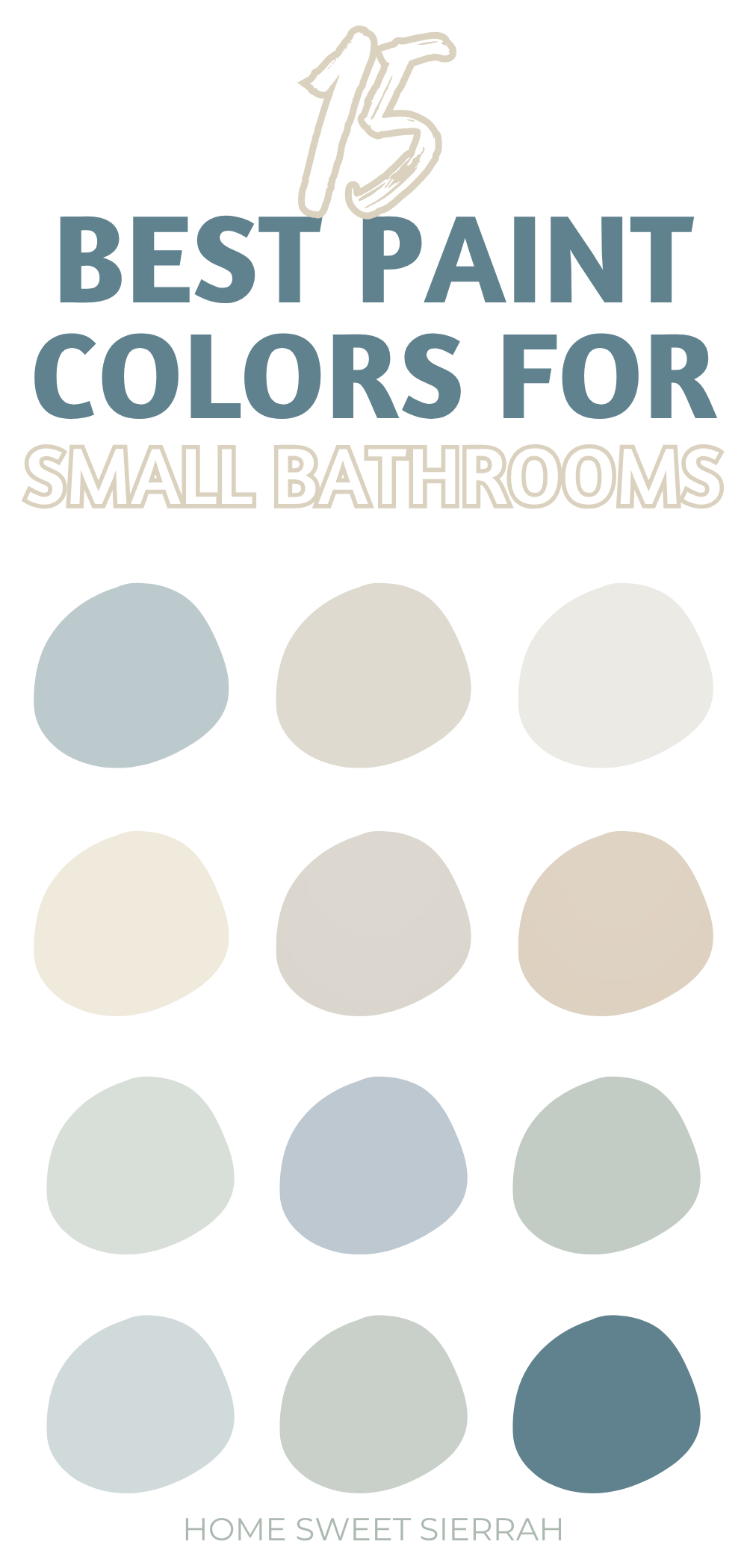
In this post, I’m sharing the best Sherwin-Williams paint colors for small bathrooms.
Including soft whites, airy neutrals, calming spa tones, and even a few bold options that actually work in small spaces.
This post contains affiliate links. For more information, please read my disclosure here.
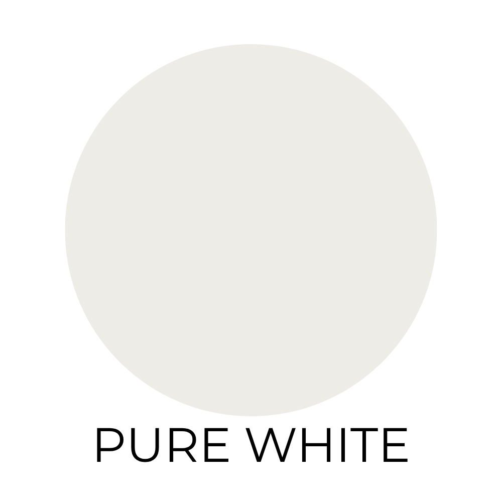
Pure White (SW 7005)
If you’re stuck and don’t know what to pick, start here.
This is one of those colors that just makes everything feel clean and fresh without trying too hard.
It’s not harsh. It’s not sterile. It just quietly does its job and makes your bathroom look brighter.
And in a small space, that’s exactly what you want.
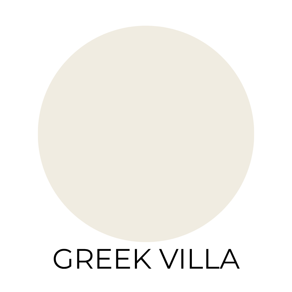
Greek Villa (SW 7551)
This is what I’d pick if I wanted white, but softer.
It has just enough warmth to make the room feel cozy instead of clinical.
If your bathroom has warmer finishes or you just don’t love that crisp, cool white look, this one feels a lot more inviting.

Snowbound (SW 7004)
Snowbound is that perfect in-between white.
It has a slight gray undertone, which makes it feel a little more modern and grounded.
If you have marble, gray tile, or black fixtures, this color just pulls everything together without being obvious about it.
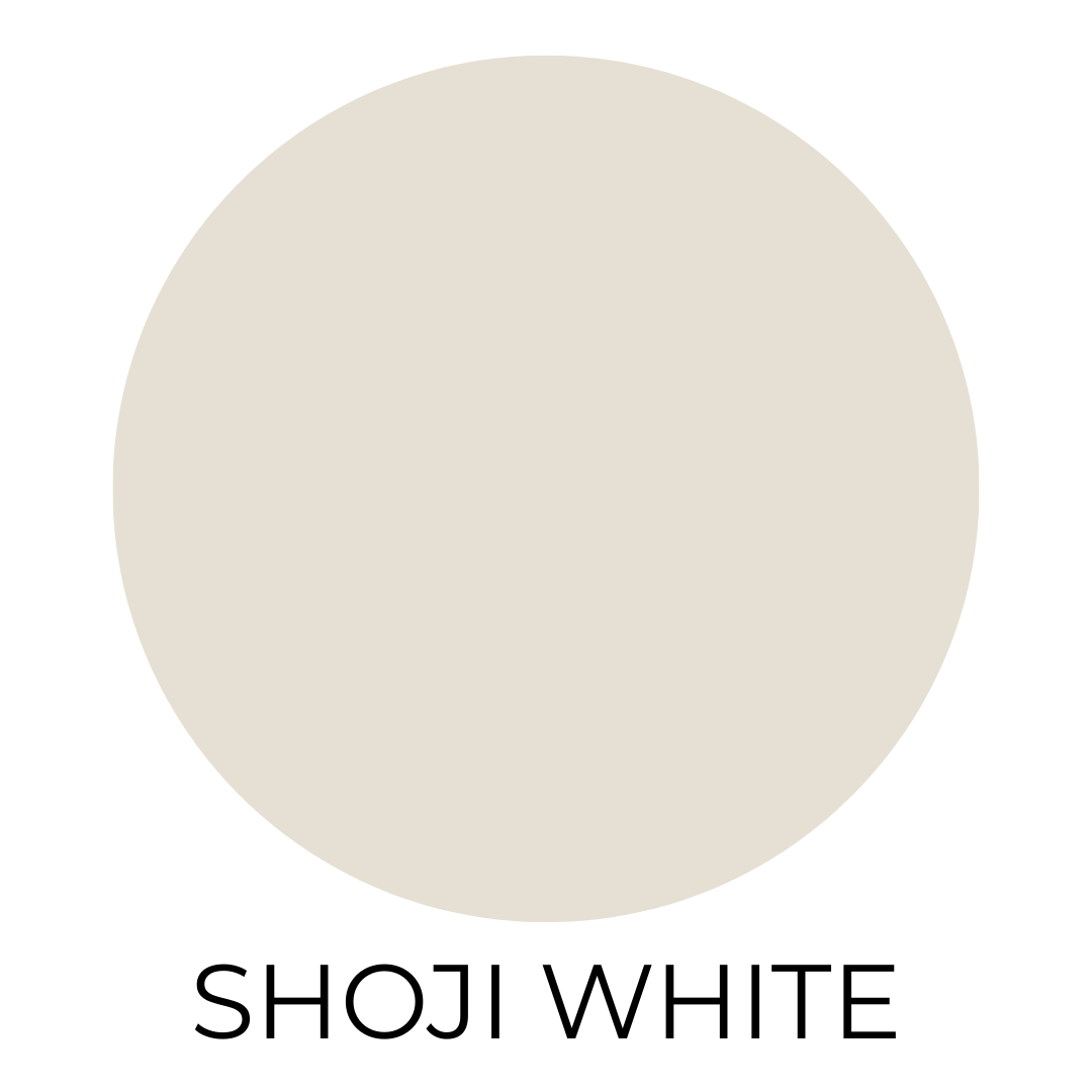
Shoji White (SW 7042)
If you’ve ever stood in the paint aisle going back and forth between gray and beige then this is your answer.
It’s soft, warm, and really easy to live with.
Nothing about this color feels trendy or risky. It just makes a small bathroom feel calm and put together.
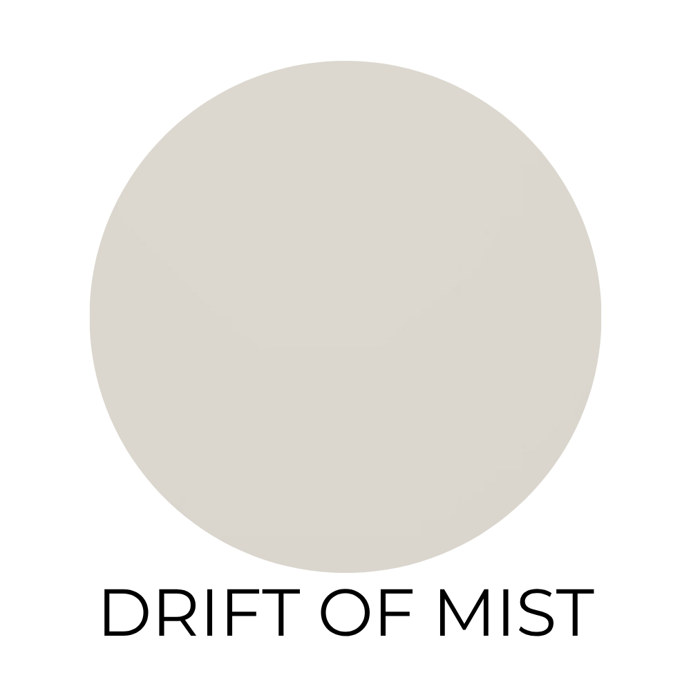
Drift of Mist (SW 9166)
This is one of those colors that people use everywhere.
It’s light, it’s neutral, and it has just enough depth so your walls don’t look flat.
In a small bathroom, that little bit of contrast actually helps the space feel more finished.
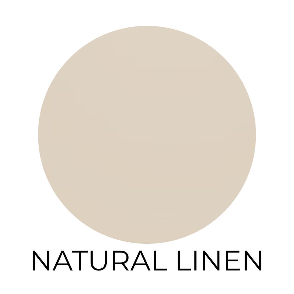
Natural Linen (SW 9109)
If you want your bathroom to feel warm and relaxed, this is such a good option.
It leans beige, but not in a dated way.
Think soft, cozy, spa-like…not builder-grade.
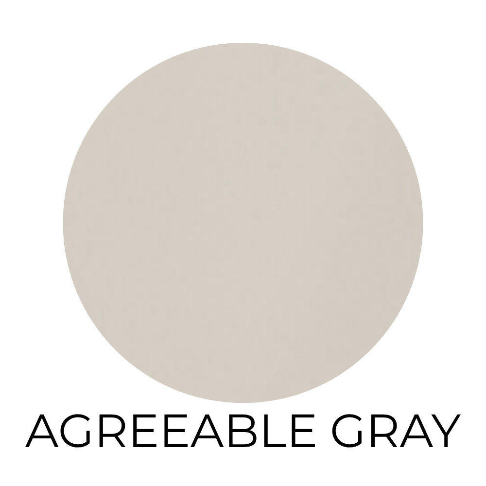
Agreeable Gray (SW 7029)
You’ve definitely heard of this one.
And yes, it’s popular, but there’s a reason.
It’s one of the easiest colors to work with. It doesn’t pull too warm or too cool, and it just kind of adapts to whatever is around it.
If you want something safe but not boring, this is a solid choice.
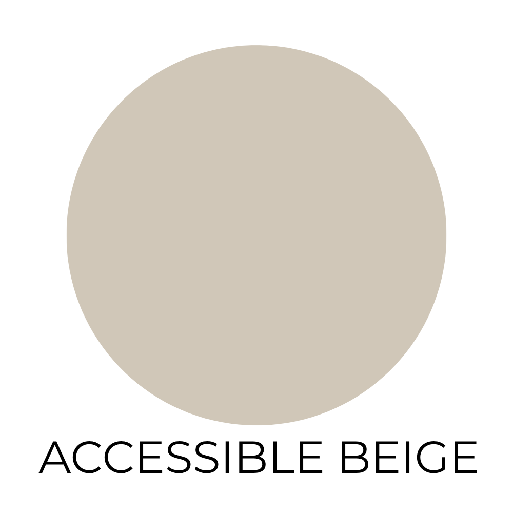
Accessible Beige (SW 7036)
This is for you if you know you like warmer tones.
It has that soft, cozy feel, but still looks clean and updated.
It works especially well if you have wood tones or brass in your bathroom.
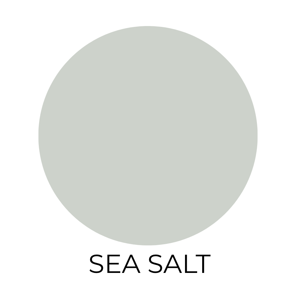
Sea Salt (SW 6204)
This color is everywhere when it comes to bathrooms.
It’s a soft mix of blue and green that instantly makes a space feel calm.
Not in a dramatic way. Just peaceful.
If you want your bathroom to feel like a little reset at the end of the day, this is a really good choice.
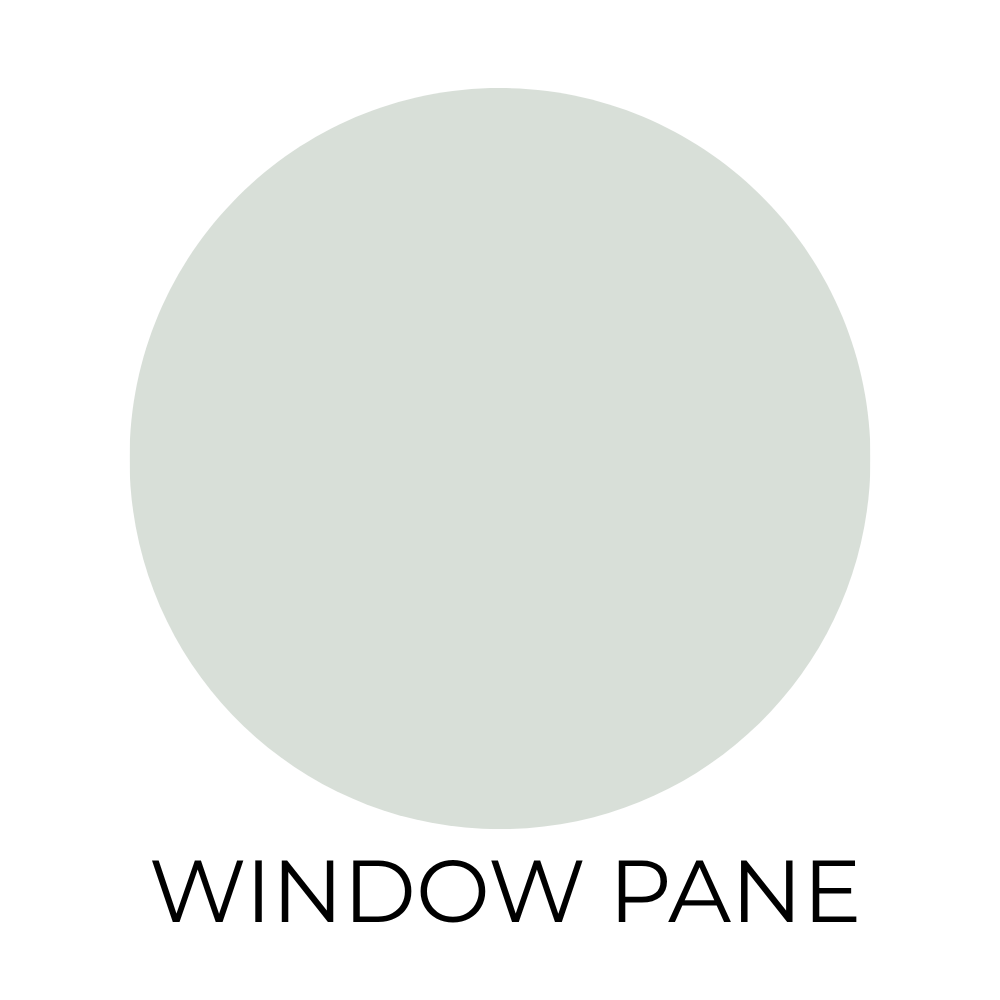
Window Pane (SW 6210)
This one feels light and airy in the best way.
It has a soft aqua tone that reflects light really well, which helps a small bathroom feel a little more open.
If you want color but still want the room to feel bright, this is a good middle ground.
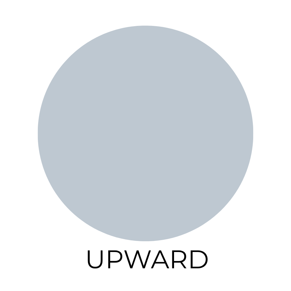
Upward (SW 6239)
Upward is a true soft blue.
No guessing, no weird undertones. Just a clean blue that feels fresh.
It’s a good option if you want something a little more noticeable, but still calming.
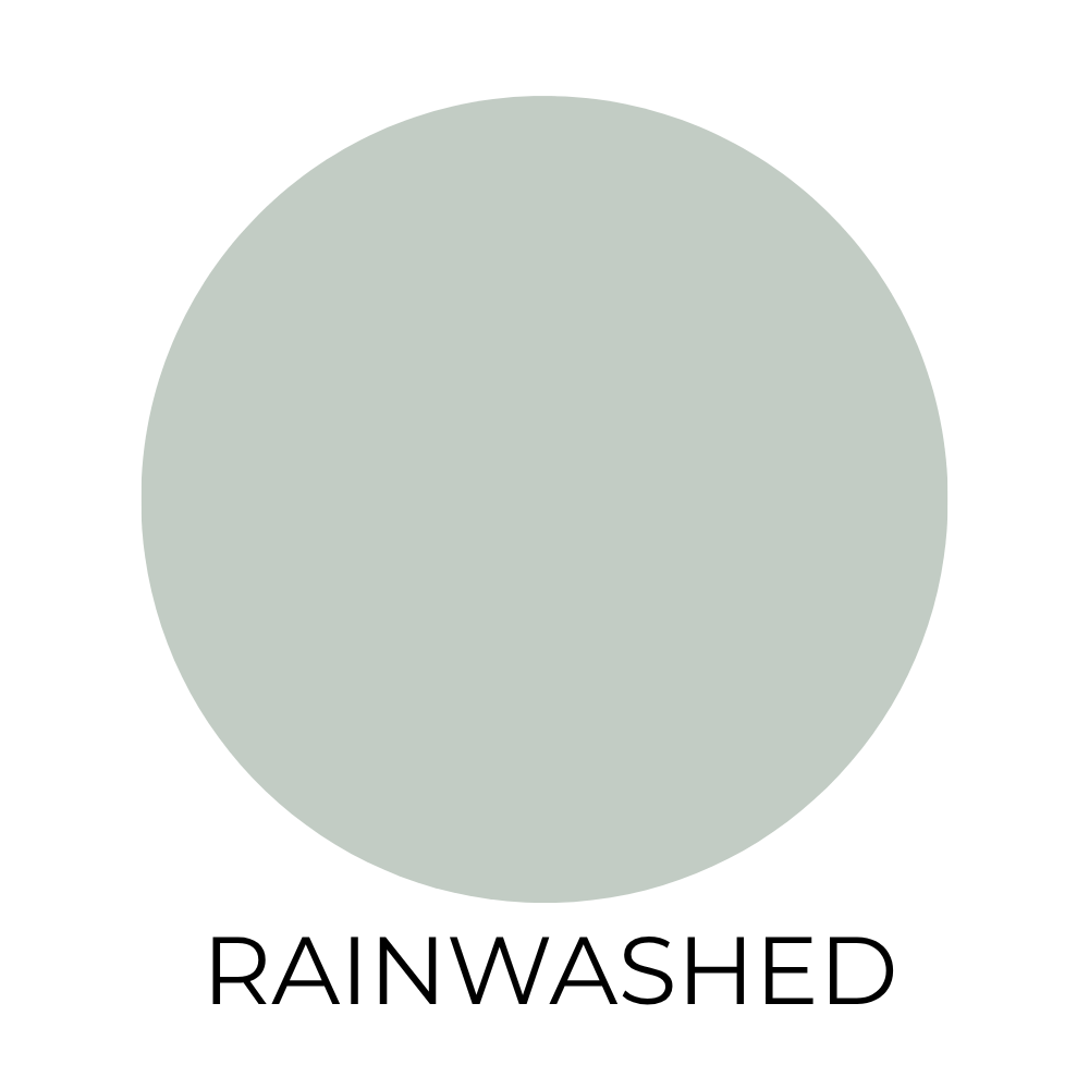
Rainwashed (SW 6211)
This one is similar to Sea Salt, but a little more muted.
It has that same blue-green feel, just toned down.
If you want color, but you don’t want it to stand out too much, this is a really easy one to live with.
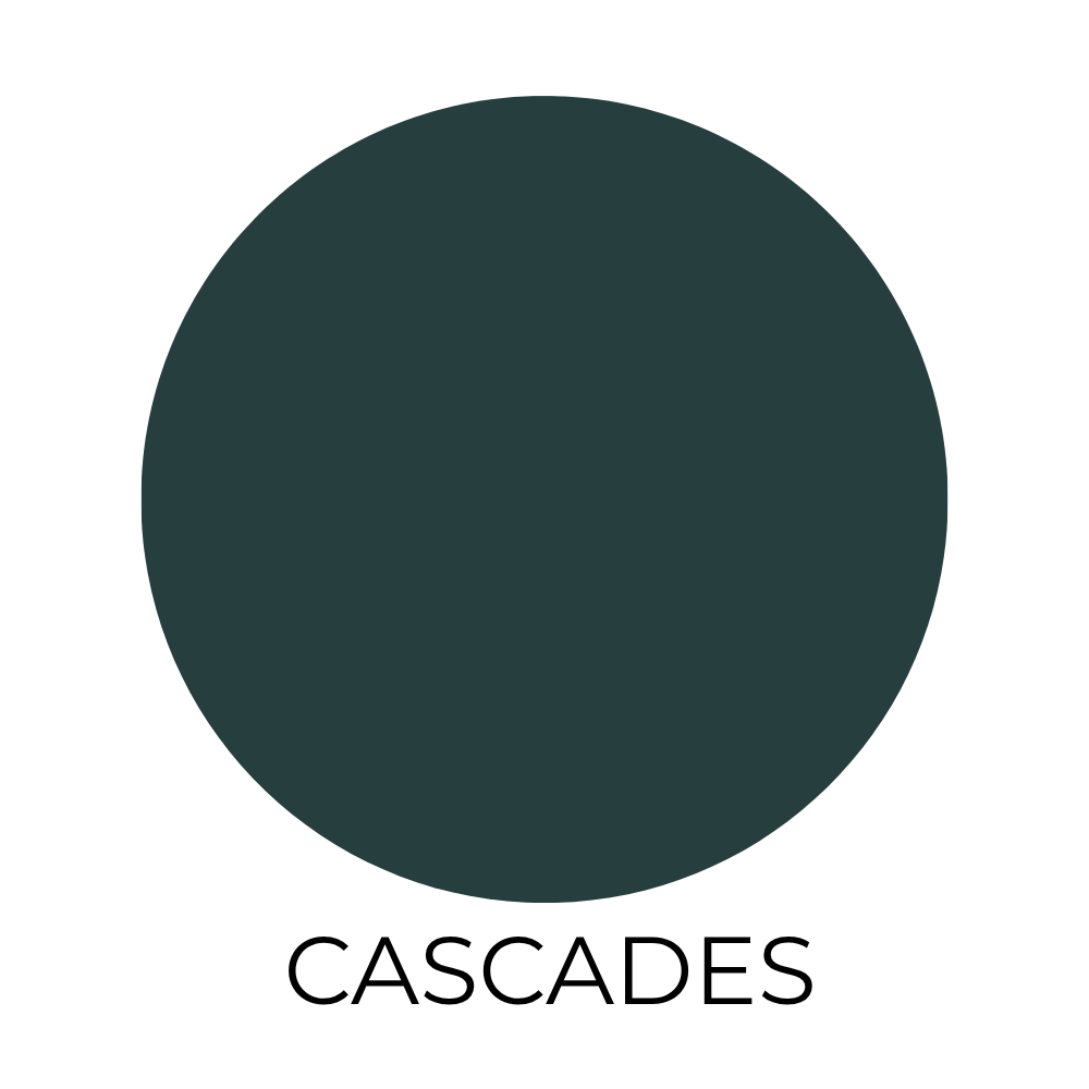
Cascades (SW 7623)
Okay, hear me out…dark colors can actually look really good in small bathrooms.
Instead of trying to make the space feel bigger, they make it feel intentional.
Cascades is a deep blue-green that gives you that cozy, almost moody look.
It’s especially good in a powder room where you want a little drama.
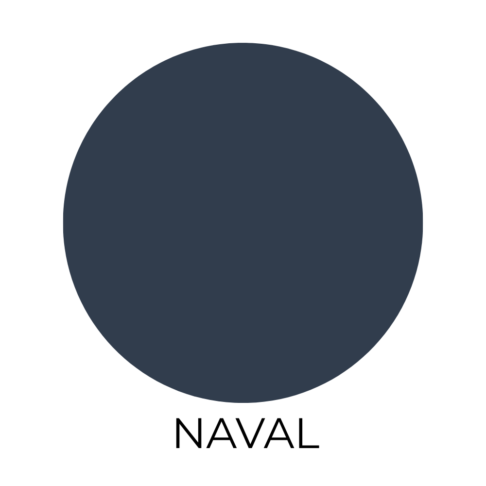
Naval (SW 6244)
This is a classic navy.
It feels a little more bold, but still timeless.
Paired with white tile or gold fixtures, it can make a small bathroom look way more high-end than it actually is.
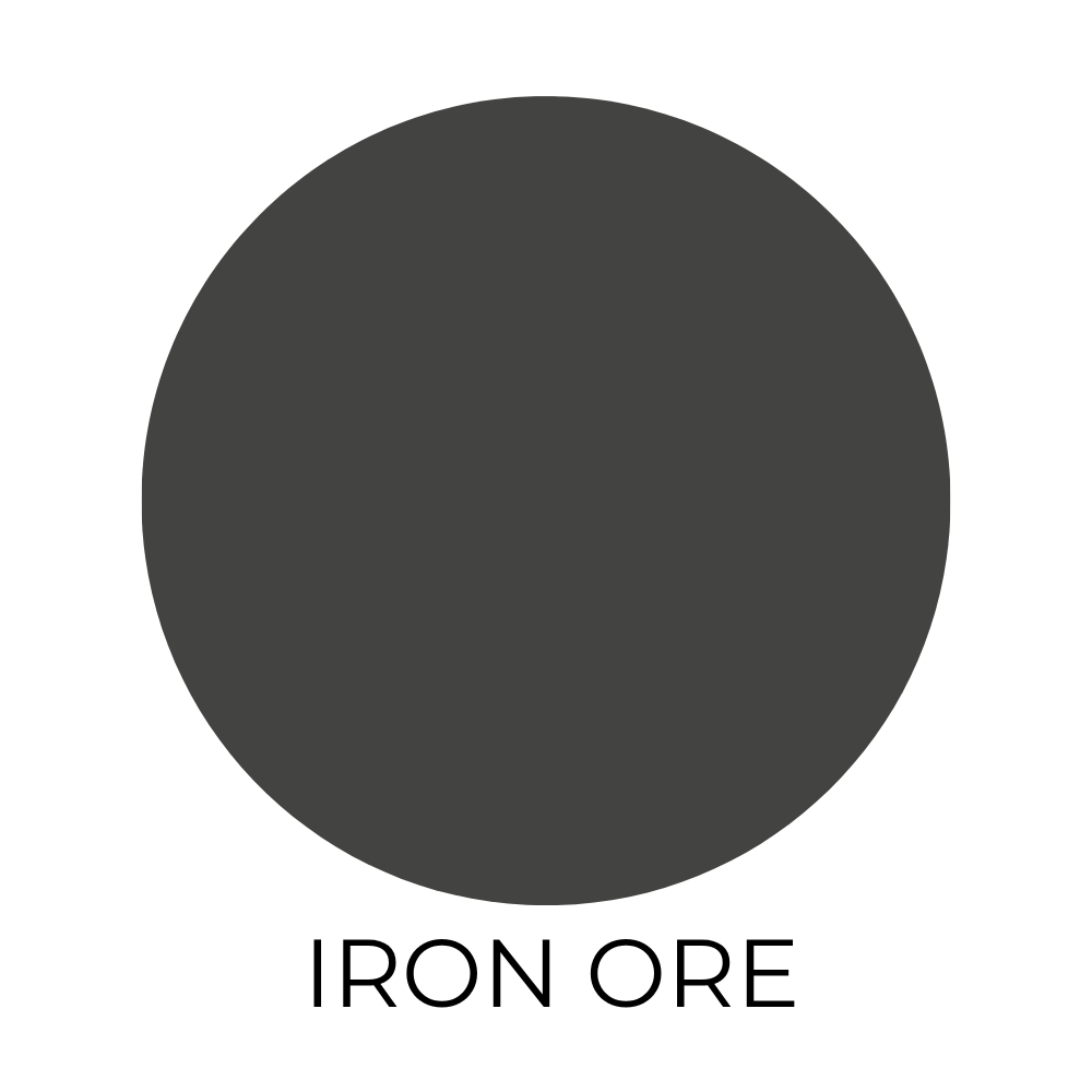
Iron Ore (SW 7069)
This is that soft black that designers love.
Not too harsh, not too flat.
Just enough depth to make the space feel a little more high-end.
It’s definitely on the moodier side, but in a small bathroom, that can actually make it feel more styled and intentional.
How to Pick the Right One
If you’re still deciding, here’s the easiest way to narrow it down:
If you want it to feel bigger, go light.
If you want it to feel calm, go blue or green.
If you want it to feel more designed, go darker.
And always test your paint first.
Lighting changes everything, especially in a small bathroom.
I like to use peel and stick samples from Samplize.
Final Thoughts
Small bathrooms are tricky, but paint makes a bigger difference than people think.
You don’t need a full renovation.
You just need the right color.
And honestly, any of these Sherwin-Williams picks will get you there.