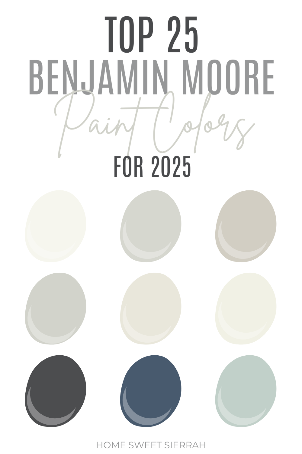
Looking for the most popular Benjamin Moore paint colors for 2026. Look no further, below you’ll find the ultimate list.
To be honest, choosing a paint color can sometimes feel like stepping into an abyss. There are thousands of options, and somehow they all start looking the same after a while.
That white you swore was perfect suddenly looks yellow. Or gray. Or… purple?
Luckily, some shades have risen above the noise. These are Benjamin Moore’s most trusted, best-selling paint colors for a reason.
They’re versatile, timeless, and they tend to look amazing regardless of lighting, furniture, or last-minute design changes. So if you’re stuck in the “what color do I even want?” stage, start here.
This post contains affiliate links. For more information, please read my disclosure here.
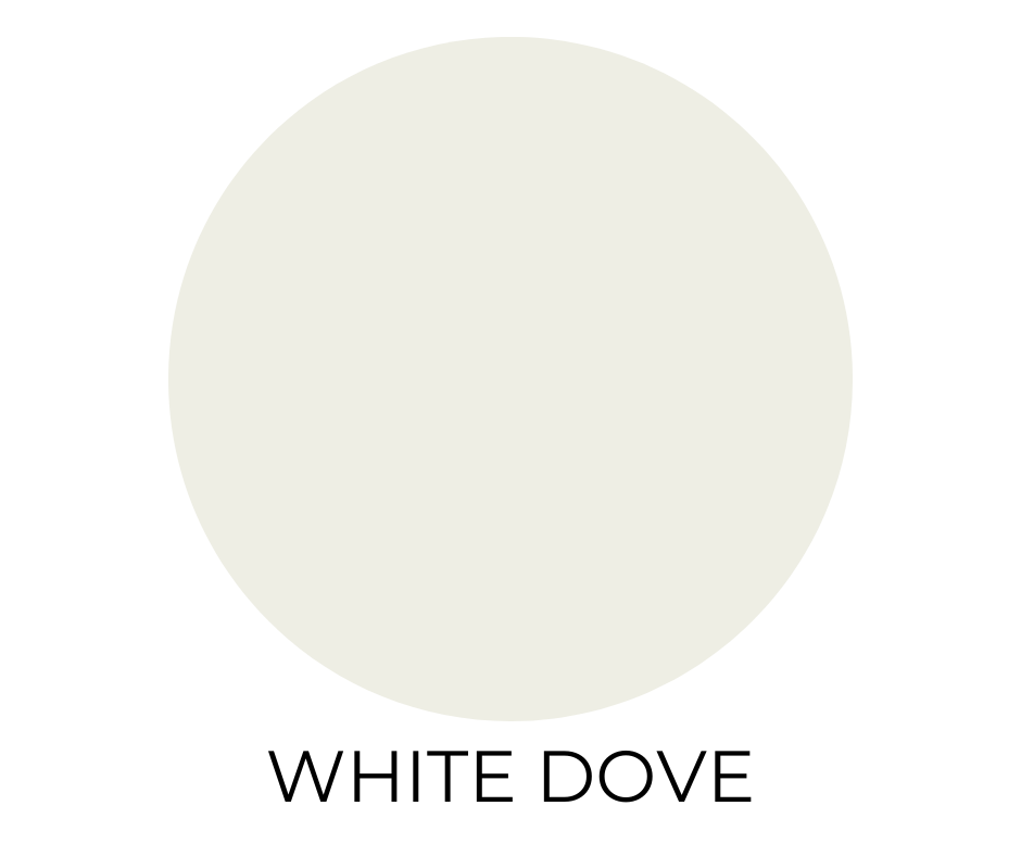
1. White Dove (OC-17)
A creamy, warm off-white that feels soft and welcoming without drifting into yellow. It’s not your stark gallery white, it’s more like a quiet classic that works in almost any room.
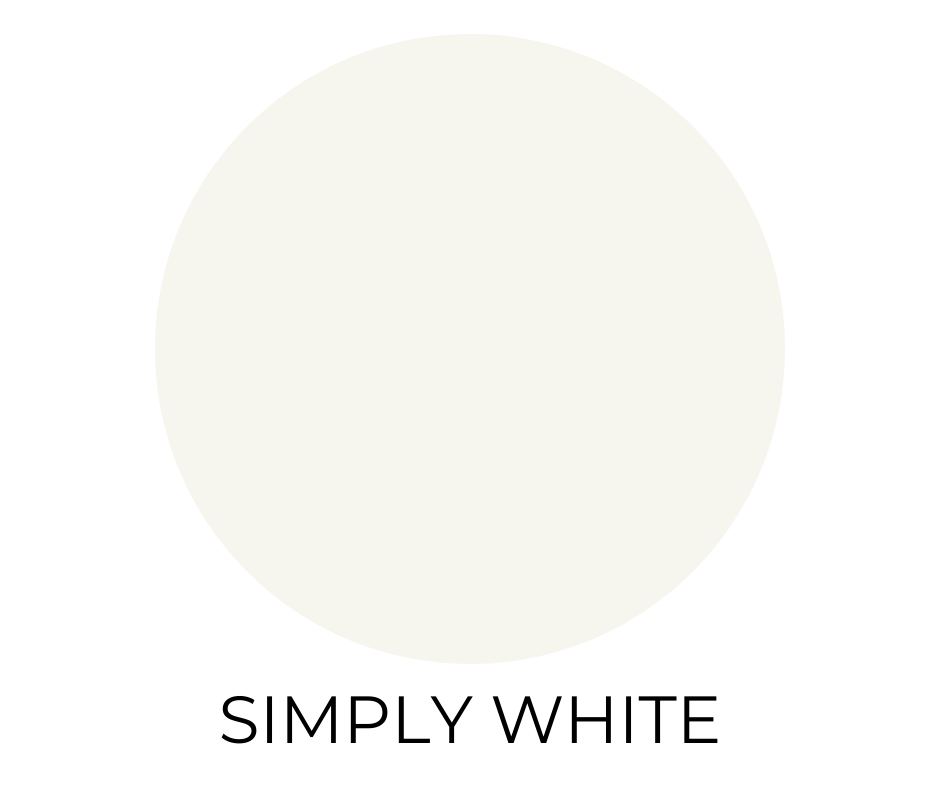
2. Simply White (OC-117)
Clean, bright, with just the faintest hint of warmth. Simply White is one of the most popular Benjamin Moore paint colors for a reason. It’s crisp but not cold, which is probably why it remains one of the most-used whites on walls, ceilings, and cabinetry alike.
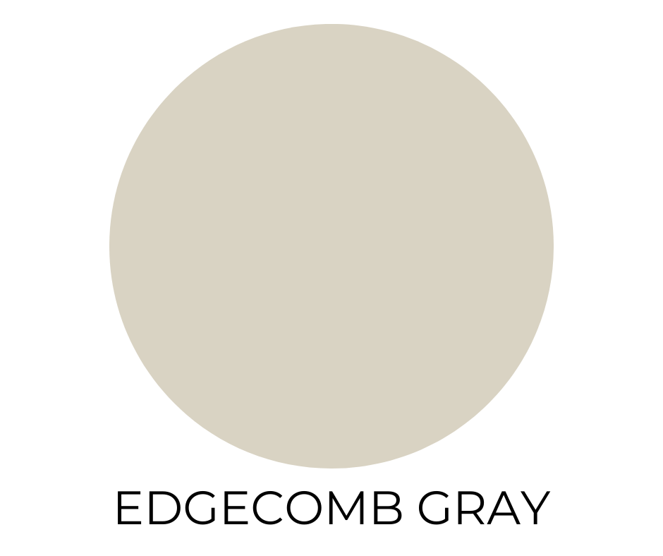
3. Edgecomb Gray (HC-173)
The perfect midpoint between beige and gray. Edgecomb gray is adaptable, subtle, and behaves beautifully in shifting light. A fantastic “starter neutral” if you’re feeling noncommittal.
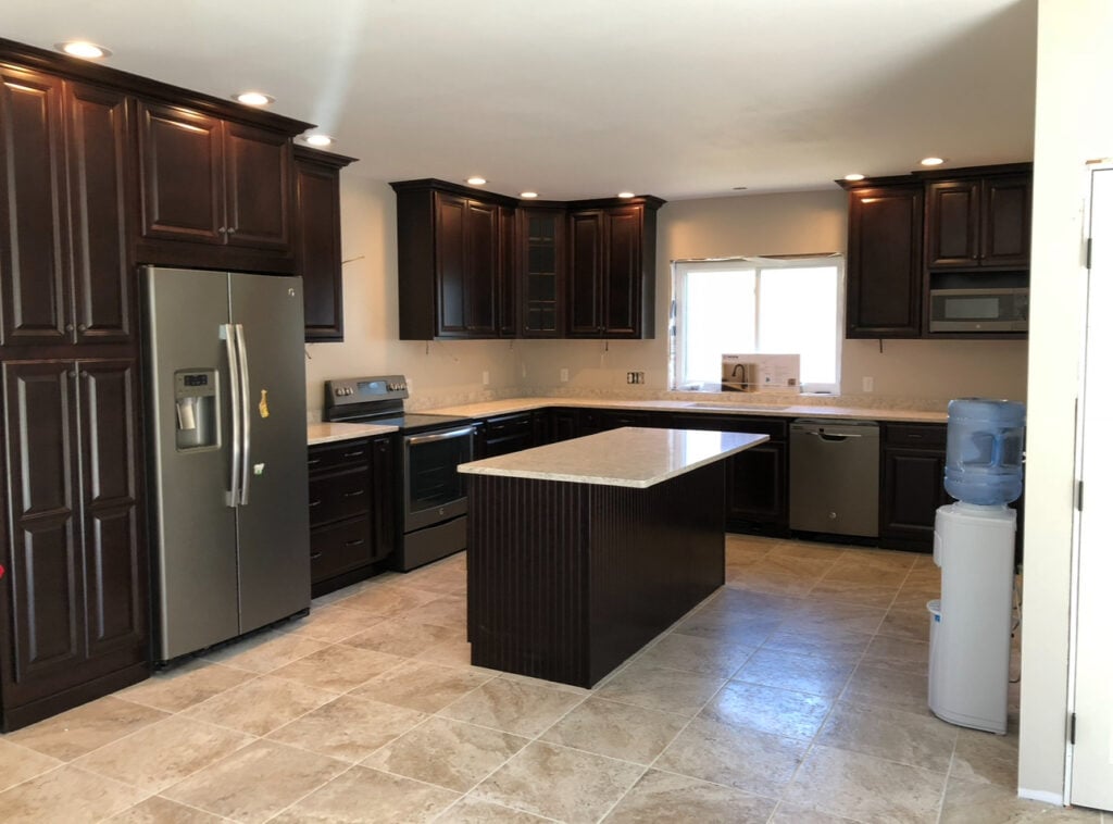
This was my kitchen in my old house, with Edgecomb gray walls. I loved how it looked with the dark wood cabinets.
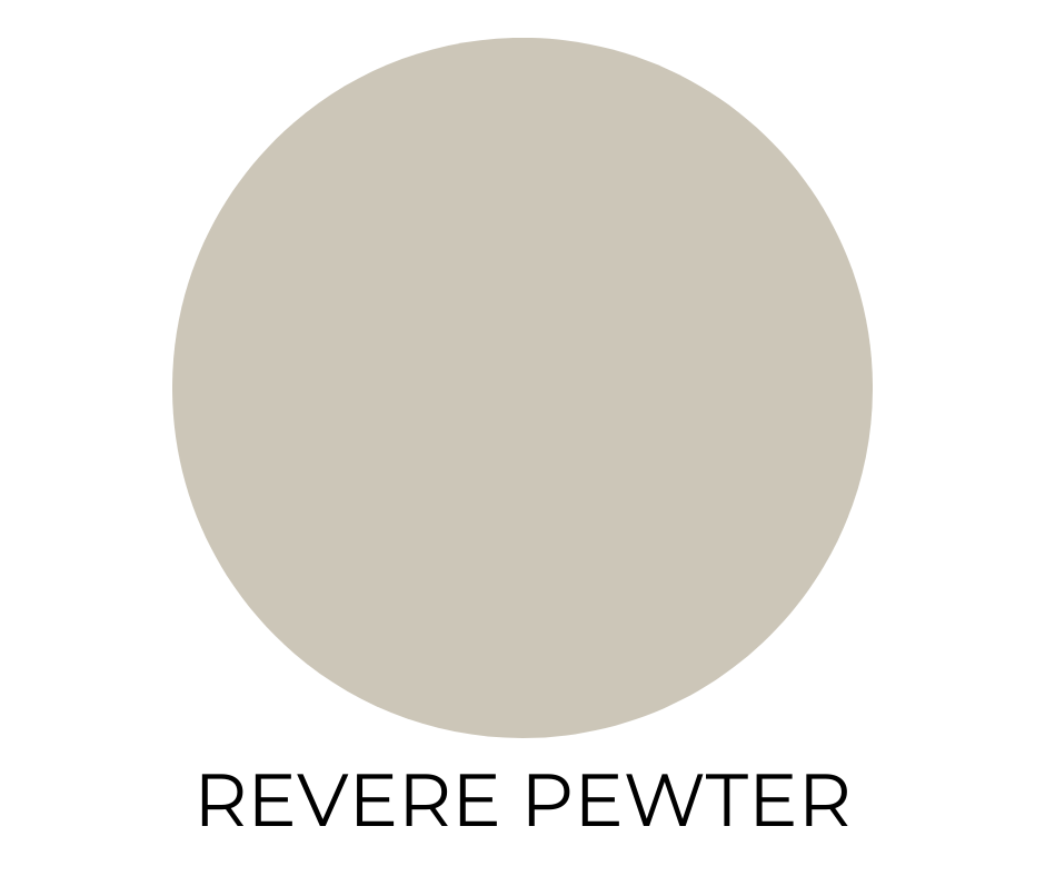
4. Revere Pewter (HC-172)
Iconic for a reason. This warm gray leans ever so slightly greige, it’s an ideal whole-home color. It plays nicely with both crisp whites and moodier hues.
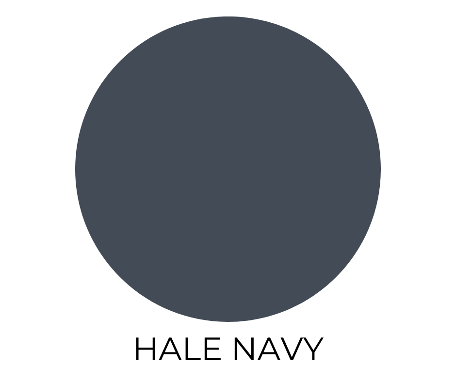
5. Hale Navy (HC-154)
Deep, rich, and endlessly elegant. This navy isn’t overly saturated or too bold. It’s just the right amount of muted. Gorgeous on cabinetry, exteriors, or a statement wall.
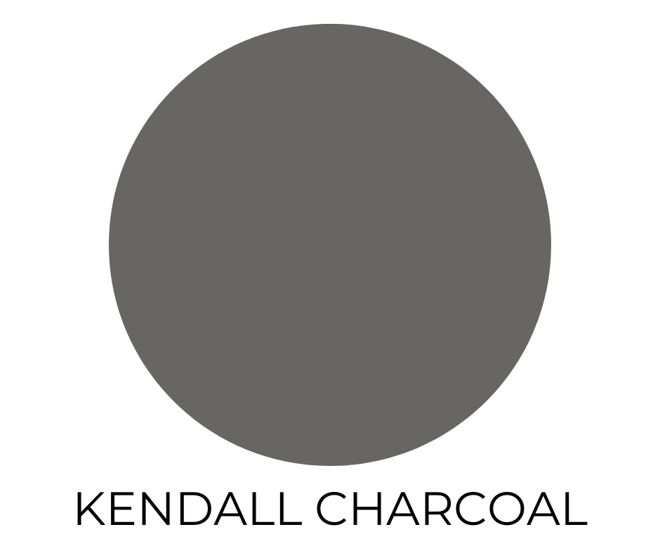
6. Kendall Charcoal (HC-166)
A moody, grounded charcoal with soft brown undertones. It’s dark, yes, but never flat. Beautiful with brass hardware, warm woods, or soft whites.
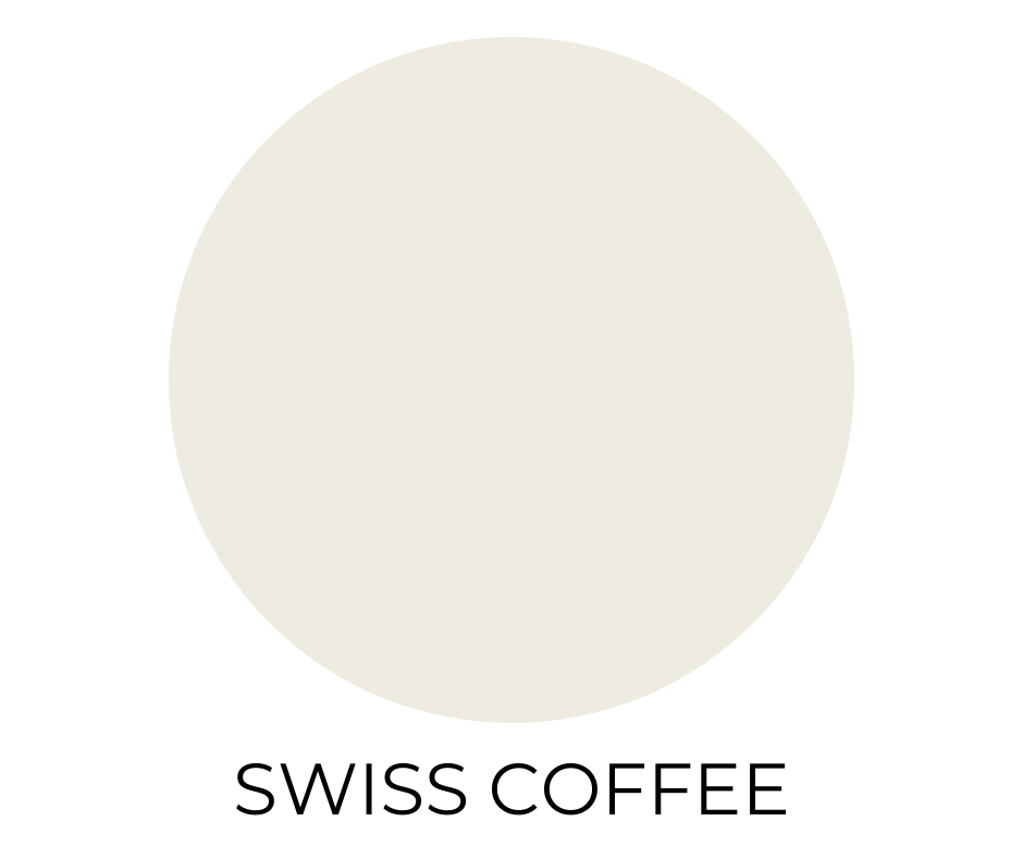
7. Swiss Coffee (OC-45)
Despite the name, it’s not brown. Swiss Coffee is a creamy off-white with warmth and depth. Think cozy morning light in a neutral, livable tone.
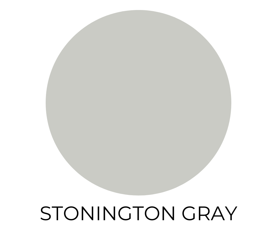
8. Stonington Gray (HC-170)
A silvery mid-tone gray with cool undertones that feel modern but not sterile. It’s a go-to for transitional spaces and classic interiors.
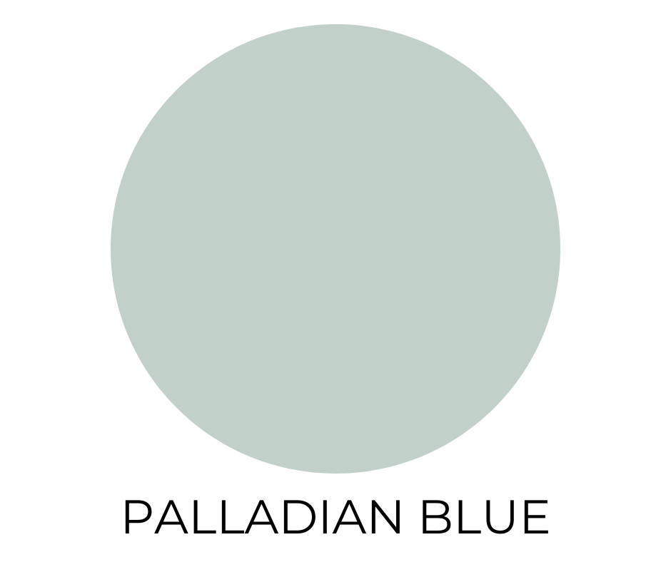
9. Palladian Blue (HC-144)
Soft, airy, and calming. Somewhere between blue, green, and a whisper of gray. Perfect for bedrooms, bathrooms, or anywhere you want serenity to be the point.
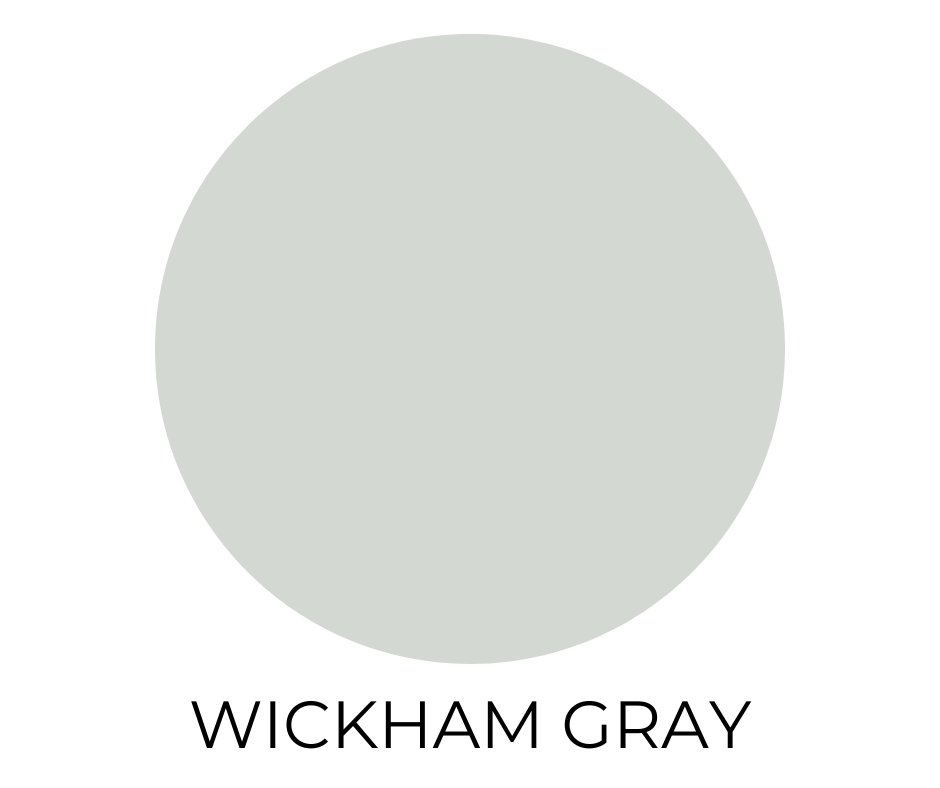
10. Wickham Gray (HC-171)
A light, slightly blue-leaning gray that stays cool without feeling cold. It’s one of the most popular Benjamin Moore paint colors because it’s reliable and elegant in rooms, especially those with abundant natural light.
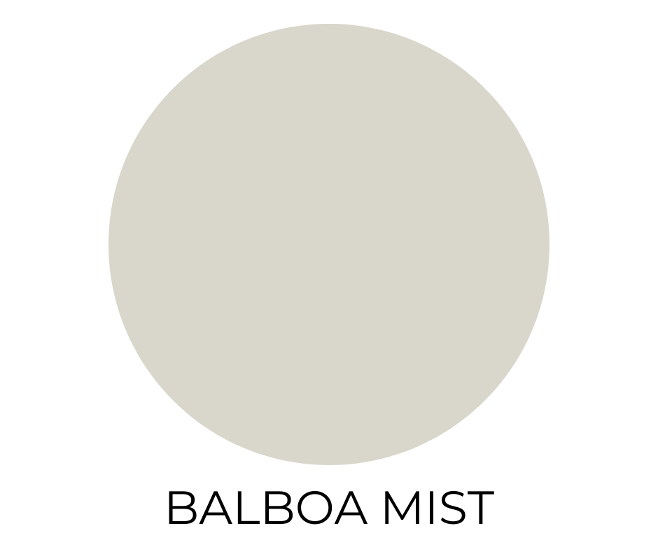
11. Balboa Mist (OC-27)
A pale, warm gray with a trace of taupe. Balboa Mist is balanced, refined, and incredibly easy to pair with both bold accents and soft neutrals.
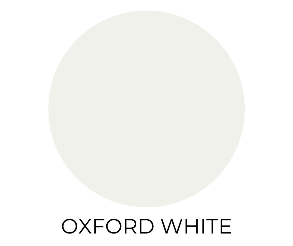
12. Oxford White (CC-30)
A crisp, bright white with a barely-there green undertone. Works especially well in modern spaces where clean contrast is key.
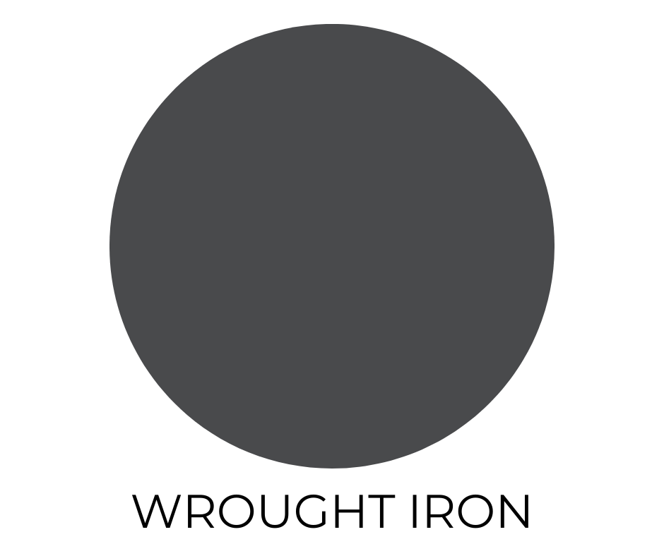
13. Wrought Iron (2124-10)
This soft black has a smoky blue undertone that gives it richness and complexity. Ideal for accent walls, cabinets, or even trim if you’re feeling adventurous.
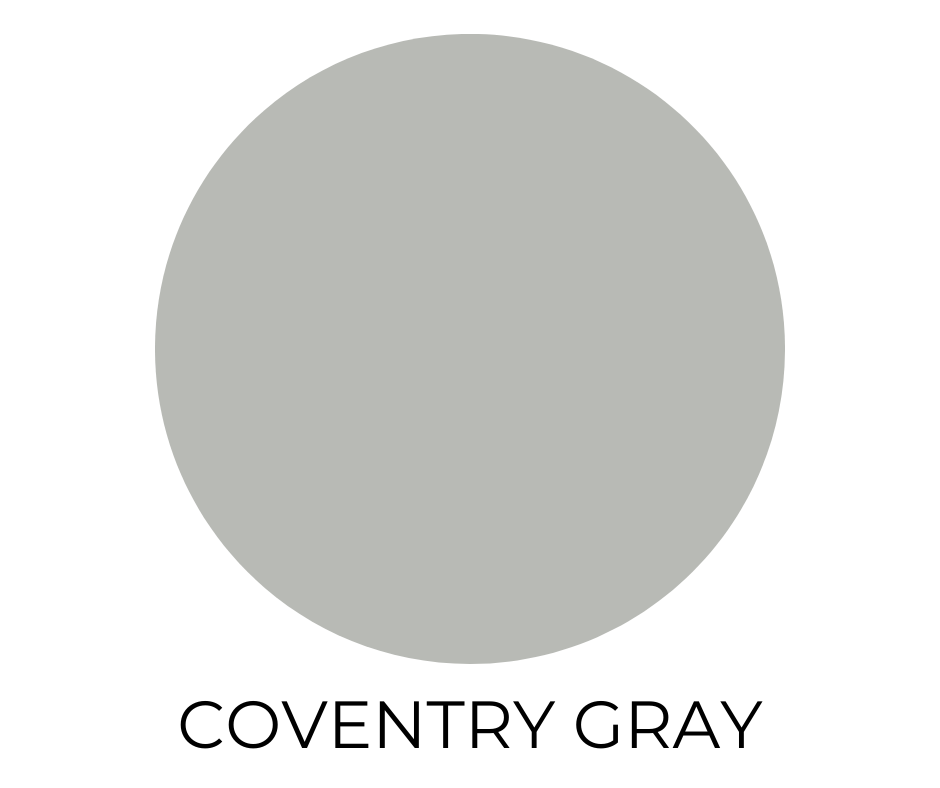
14. Coventry Gray (HC-169)
A classic medium gray that walks the line between warm and cool. Elegant without being attention-seeking. This one is ideal in both modern and traditional interiors.
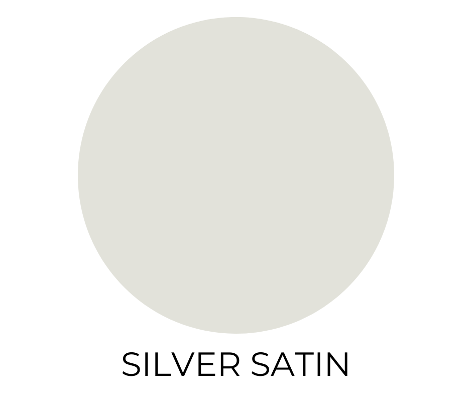
15. Silver Satin (OC-26)
A light, luminous gray that almost reads as white in certain spaces. Sophisticated and understated, it’s perfect for spaces where you want the architecture to speak.
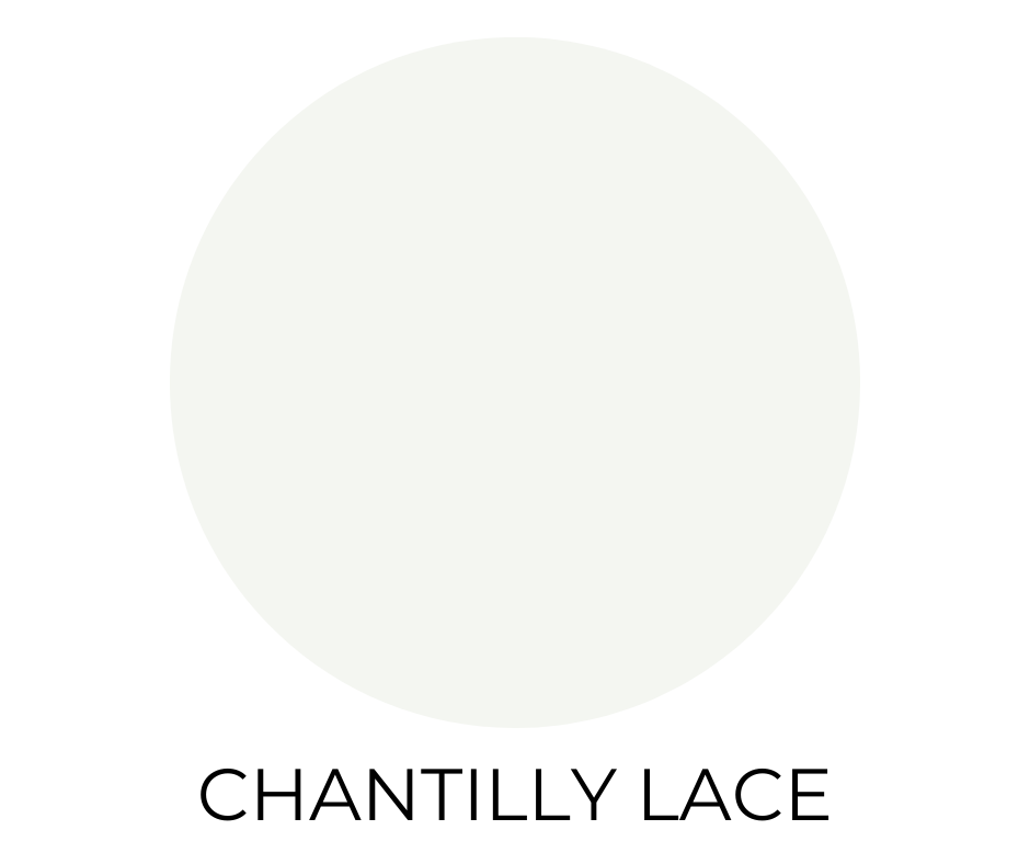
16. Chantilly Lace (OC-65)
One of Benjamin Moore’s purest whites. Chantilly Lace is crisp, clean, and nearly undertone-free. A favorite among designers for trim, ceilings, and any spot where clarity matters.
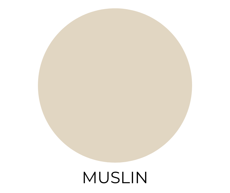
17. Muslin (CC-110)
A warm and welcoming neutral with effortless charm. This soft neutral is especially cozy in kitchens and living spaces.
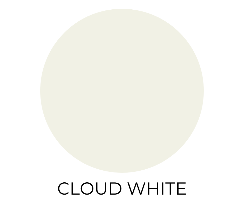
18. Cloud White (OC-130)
A warm white that feels soft and grounded. It’s subtle enough for walls, yet versatile enough to use on trim or cabinetry without clashing.
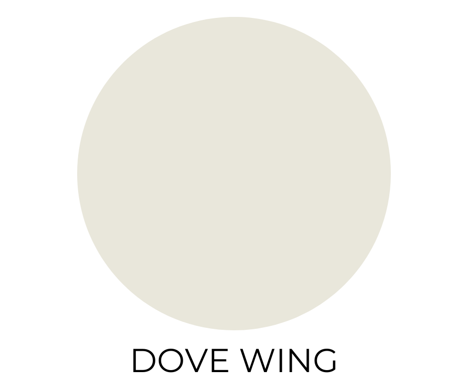
19. Dove Wing (OC-18)
An elegant off-white with gentle gray undertones that add just the right amount of sophistication. It’s timeless and quietly beautiful.
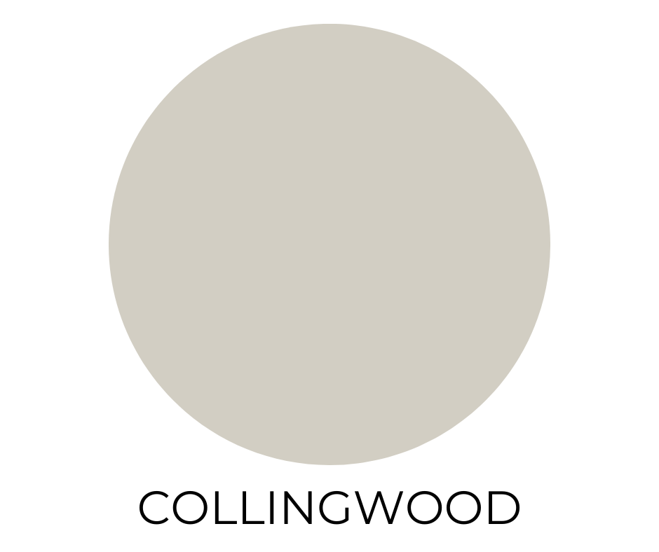
20. Collingwood (OC-28)
A warm greige that manages to feel both fresh and classic. If you’re looking for something that works in every room, this is a smart place to land.
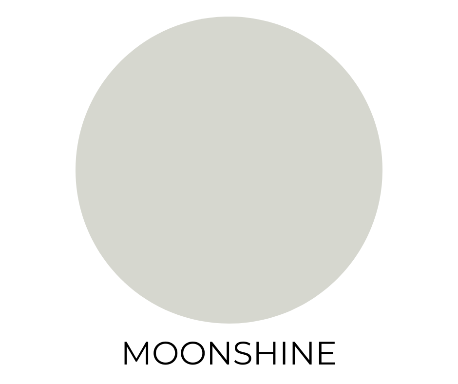
21. Moonshine (OC-56)
A pale gray with blue-green undertones. Light and tranquil, it adds subtle personality without overwhelming a space.
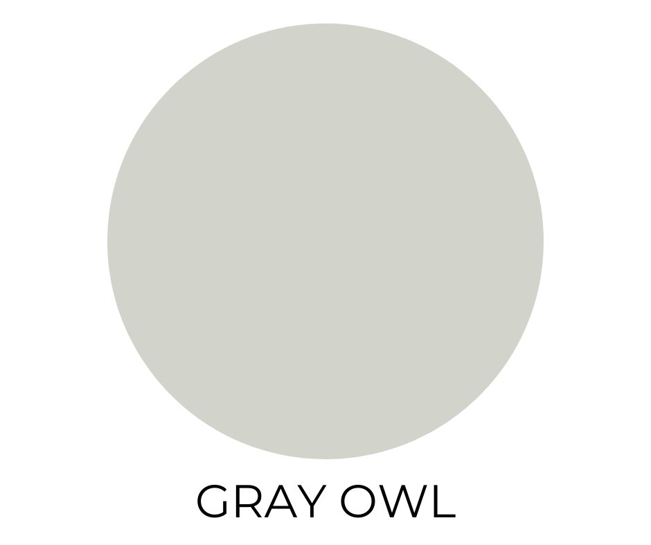
22. Gray Owl (OC-52)
Cool, contemporary, and quietly stylish. This pale gray shifts with the light—sometimes cooler, sometimes a touch green—but always balanced.
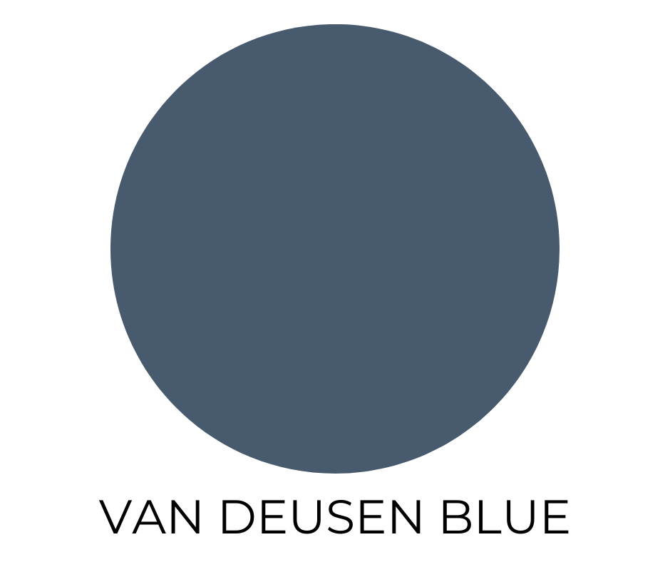
23. Van Deusen Blue (HC-156)
A dignified navy with strong presence and historic character. It works beautifully with crisp whites and brass accents, and adds instant depth to any space.
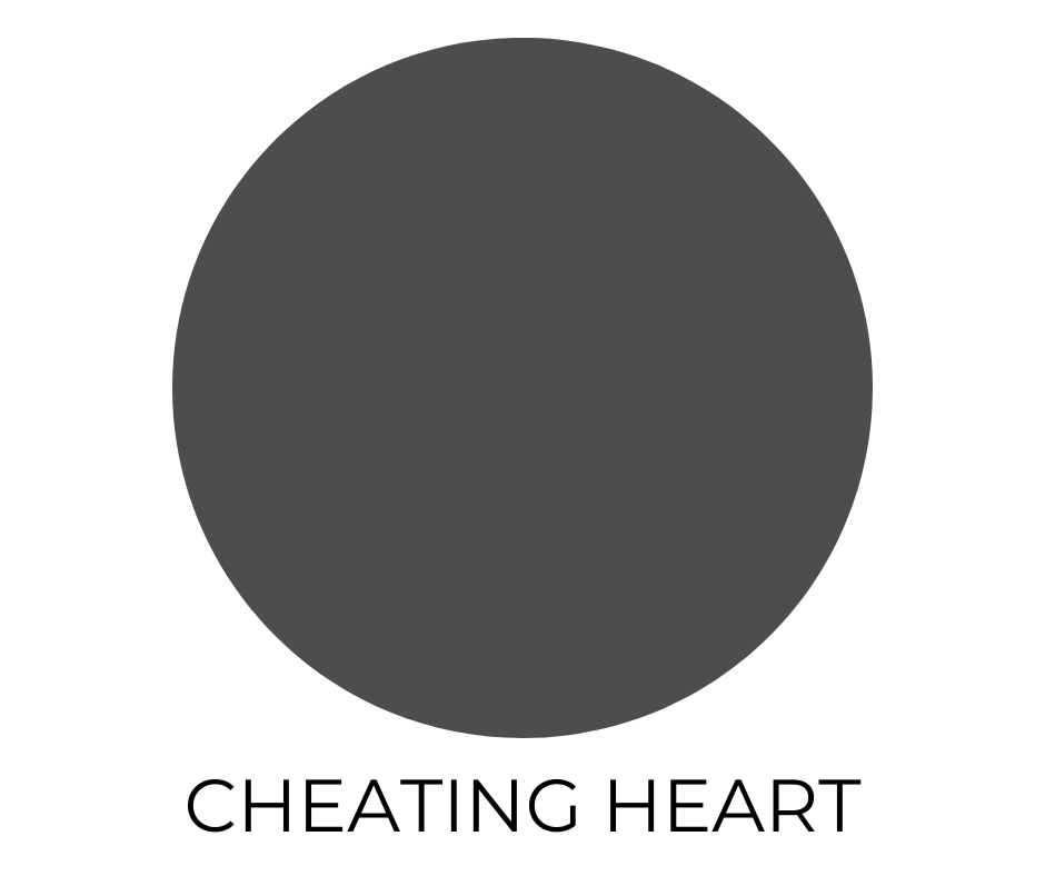
24. Cheating Heart (1617)
This dark charcoal flirts with black but softens with cool navy undertones. It’s bold and dramatic, perfect for statement-making interiors.
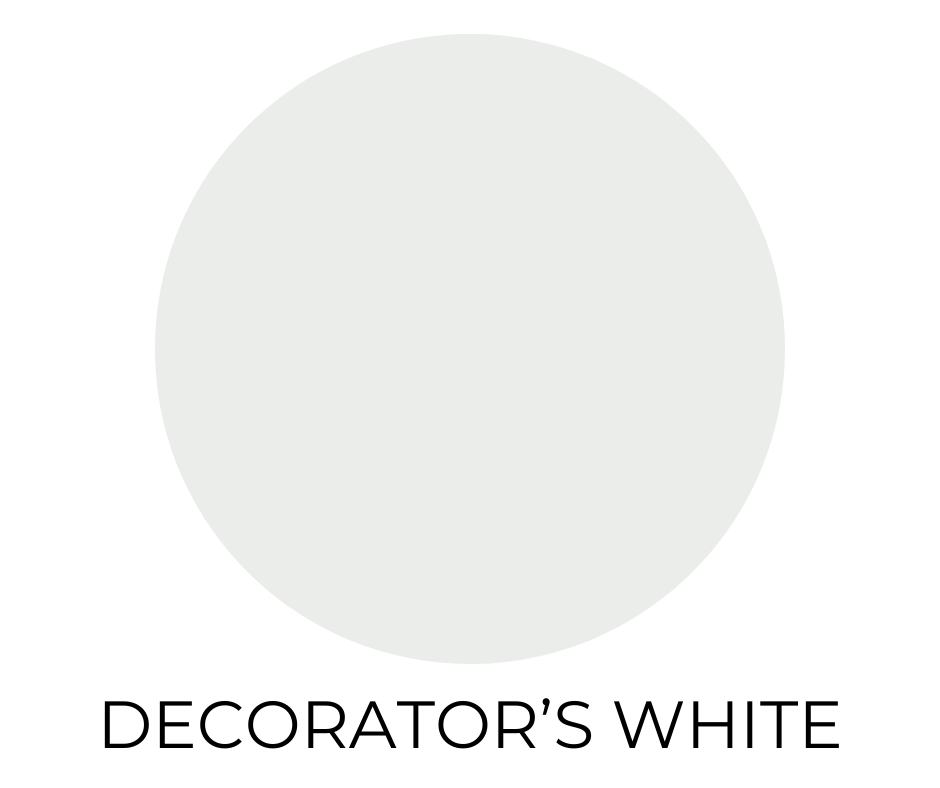
25. Decorator’s White (CC-20)
Bright, cool, and ever-popular among designers. It has a touch of gray and purple, which keeps it from feeling stark but still reads as fresh and modern.
Where To Find Samples?
If you’re looking for samples for these most popular Benjamin Moore paint colors I recommend Samplize.
Samplize offers the best peel and stick paint color sample to test out your color on your walls in your home in different lighting, before you buy.
Trust me, always sample before you paint your walls. It is no fun doing all that work painting, or paying for a painter to realize afterward you don’t really like a color.
Final Thoughts
Whether you’re repainting an entire home or just freshening up a guest room, these most popular Benjamin Moore paint colors a a must to consider.
The key to success? Test them on your actual walls, because lighting really does change everything. When in doubt, start with a swatch, take a breath, and trust the process.
Need help narrowing down your choices? I’m happy to help you find the perfect match for your space, style, and lighting. Leave a comment below or send me an email on my contact page.