When it came time to choose timeless whole house paint colors for my own home, I knew I wanted something that would feel calm and classic.
Not trendy today and outdated tomorrow.
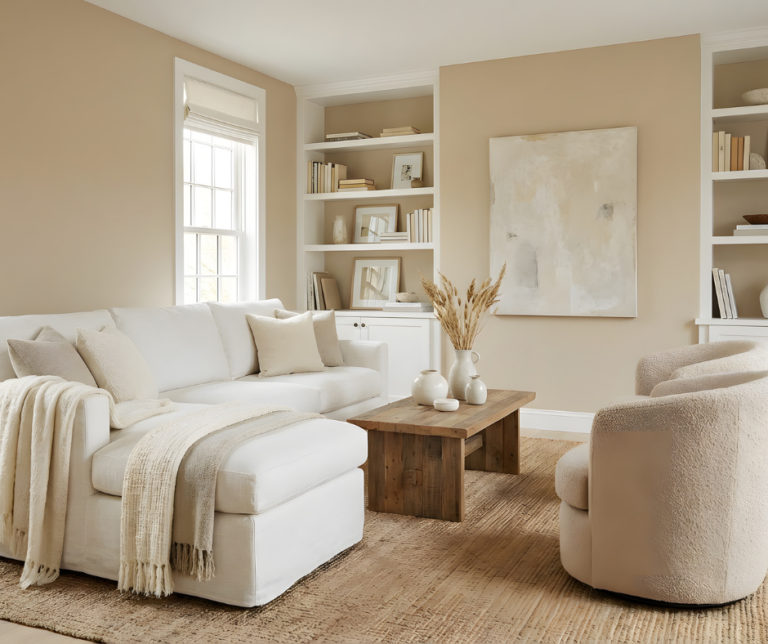
After what felt like hours of staring at paint swatches, I finally landed on Sherwin Williams Alabaster, and honestly, it was one of the best decisions I made.
Sticking with one main color throughout the home helps everything feel connected.
Different colors in every room can start to feel a little chaotic or messy, and finding coordinating color schemes can be harder than it sounds!
Choosing a timeless, neutral color makes the whole house flow effortlessly, plus it saves you from decision fatigue when it’s time to repaint.
If you’re looking for that same easy, classic feel, these 12 whole-house paint colors will never go out of style.
📌 Don’t lose it, pin it for later!
This post contains affiliate links. For more information please read my disclosure here.
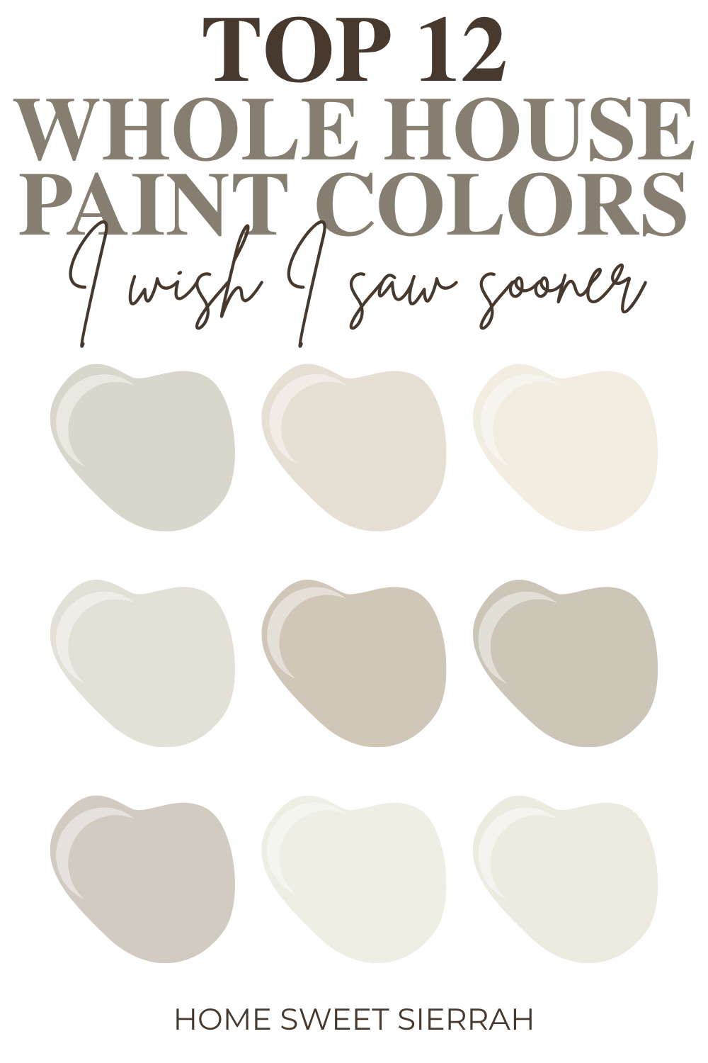
12 Best Whole House Paint Colors
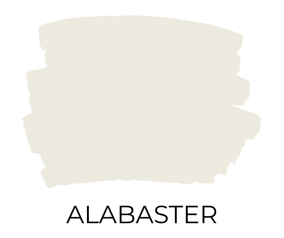
1. Sherwin Williams Alabaster (SW 7008)
• LRV: 82
• Undertones: Soft, creamy undertones with just a whisper of beige, no starkness.
Alabaster strikes the perfect balance between warmth and brightness. It’s inviting without feeling too yellow or cold, making it a classic choice for a cohesive, calm home. It’s also the color I chose for my own home, and I still love how fresh and cozy it feels years later.
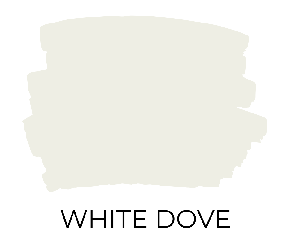
2. Benjamin Moore White Dove (OC-17)
• LRV: 85.38
• Undertones: Warm, creamy undertones with a touch of soft gray.
White Dove is beloved for being a soft, welcoming white that’s never harsh or clinical. It’s bright but grounded, making it a timeless choice for homes of any style.
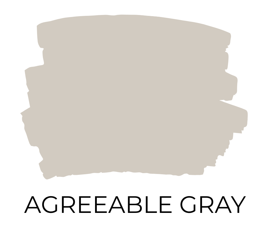
3. Sherwin Williams Agreeable Gray (SW 7029)
• LRV: 60
• Undertones: A balanced greige with warm beige and slight green undertones.
Agreeable Gray’s ability to work with warm and cool palettes makes it a classic. It adds a hint of color without overwhelming, perfect for a cozy, neutral backdrop. If I ever repaint, this one is high on my list — it’s such a perfect not-too-warm, not-too-cool neutral.
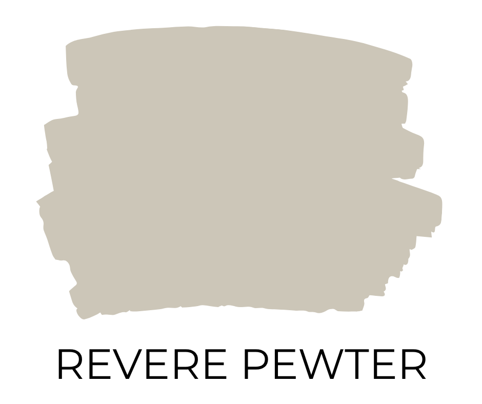
4. Benjamin Moore Revere Pewter (HC-172)
• LRV: 55.51
• Undertones: Warm gray with soft taupe and slight green undertones.
Revere Pewter has stood the test of time thanks to its versatility. It’s a warm, earthy neutral that creates a calm, lived-in feel without feeling dated.
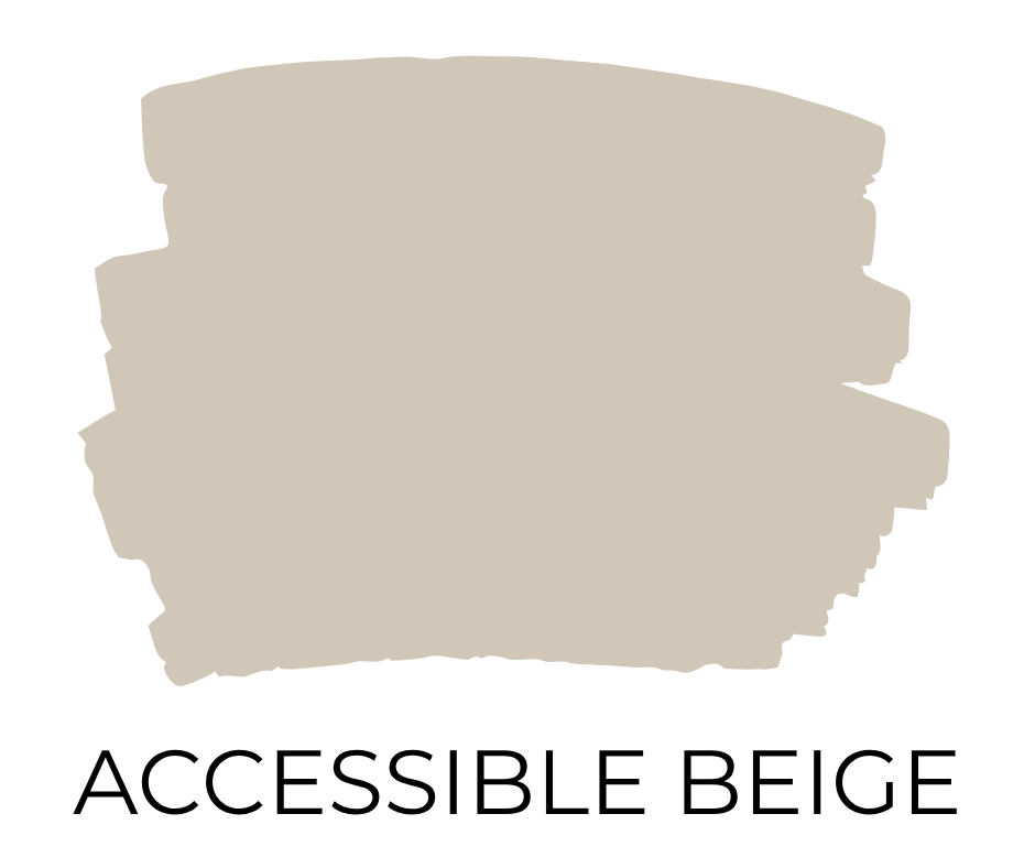
5. Sherwin Williams Accessible Beige (SW 7036)
• LRV: 58
• Undertones: Warm beige with a slight gray undertone.
Accessible Beige is a modern take on beige — warm without being yellow or heavy. It blends beautifully with both traditional and contemporary styles.
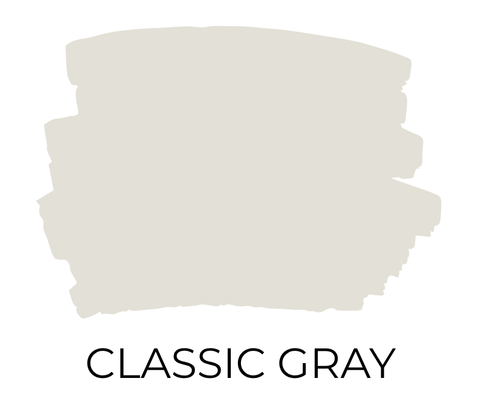
6. Benjamin Moore Classic Gray (OC-23)
• LRV: 74.78
• Undertones: Very light gray with soft, warm undertones.
Classic Gray is a whisper-light neutral that adds just enough warmth to avoid looking cold. Its subtlety keeps it feeling fresh and timeless for years.
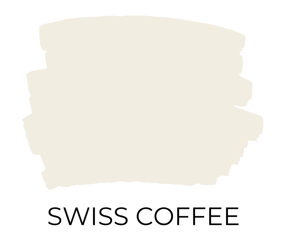
7. Behr Swiss Coffee (12)
• LRV: 84
• Undertones: Warm, creamy white with a touch of yellow.
Swiss Coffee is a cozy, creamy white that makes a home feel instantly inviting. I’ve been seeing Swiss Coffee everywhere lately — it’s definitely rising in popularity for that soft, lived-in white look.

8. Sherwin Williams Shoji White (SW 7042)
• LRV: 74
• Undertones: Soft white with greige and beige undertones.
Shoji White’s subtle warmth and softness give it an understated elegance. It pairs effortlessly with wood tones and neutrals, perfect for timeless interiors.
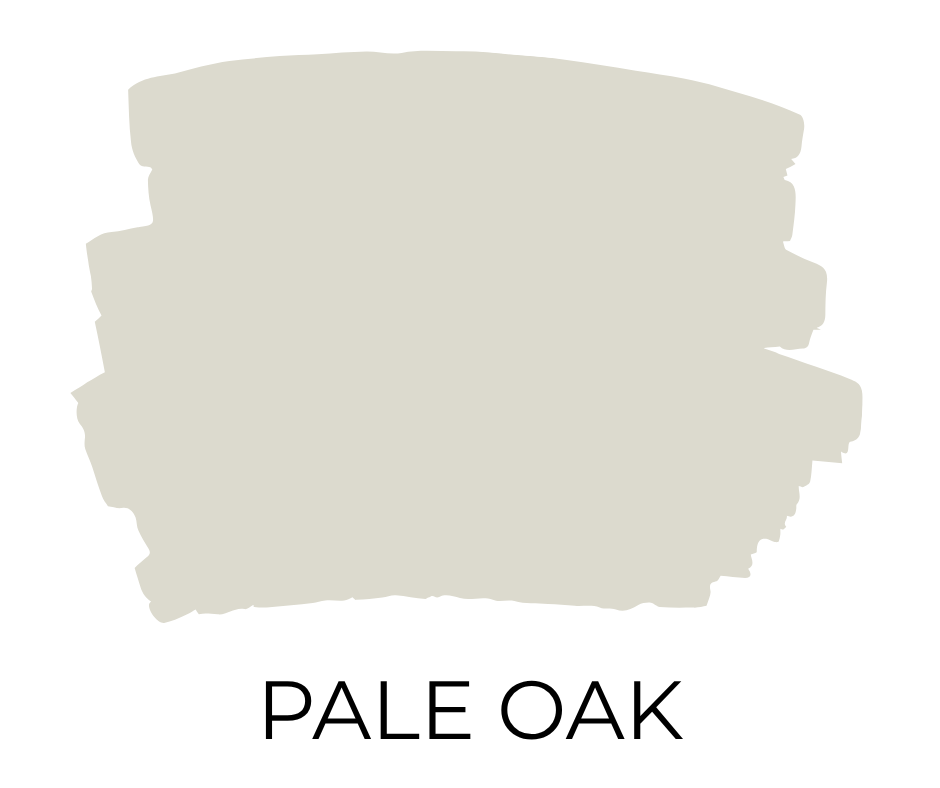
9. Benjamin Moore Pale Oak (OC-20)
• LRV: 68.64
• Undertones: Soft taupe with a slight pink and purple undertone in some lighting.
Pale Oak is the definition of an adaptable neutral. It offers just enough color to add depth without demanding attention, perfect for a serene, timeless home.

10. Sherwin Williams Aesthetic White (SW 7035)
• LRV: 73
• Undertones: Soft beige with subtle gray undertones.
Aesthetic White is a warm, muted neutral that brings a cozy feel without looking dated. It’s one of those under-the-radar colors I wish more people knew about — simple, soft, and never overpowering.

11. Behr Silver Drop (790C-2)
• LRV: 69
• Undertones: Very light gray with a hint of green undertone.
Silver Drop is a bright, clean color that stays soft and inviting. It’s one of those rare grays that looks good in almost any light and style, making it a forever favorite.
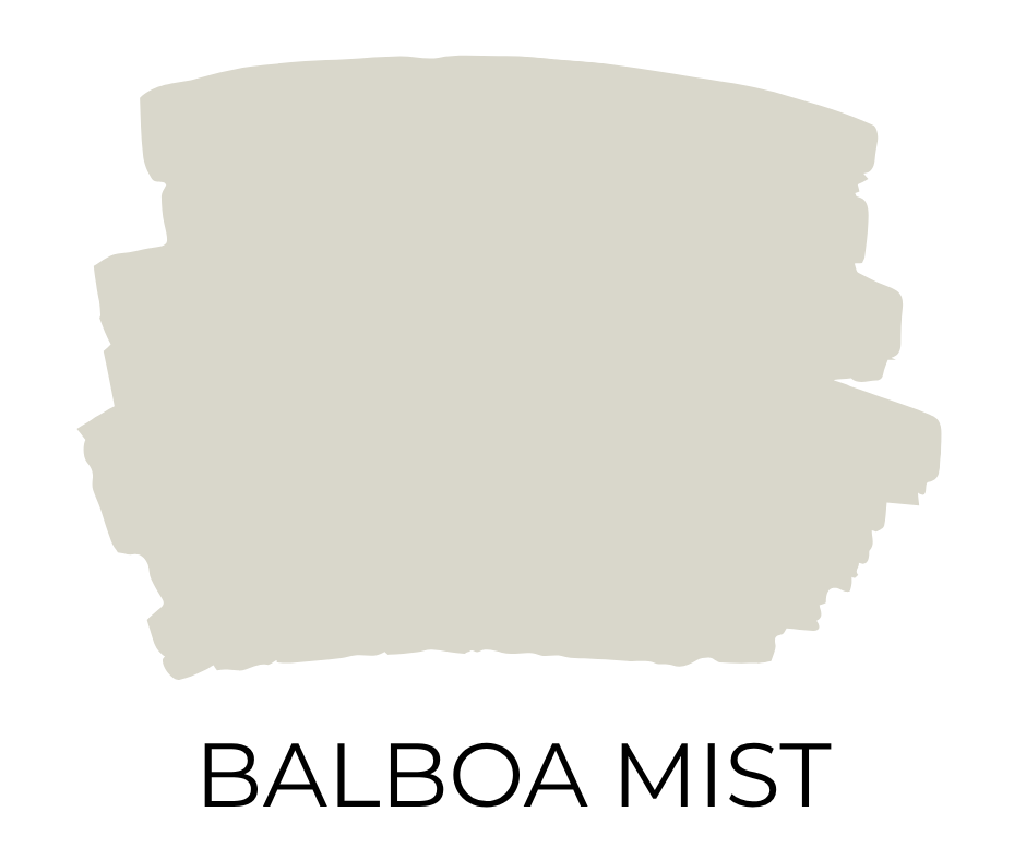
12. Benjamin Moore Balboa Mist (OC-27)
• LRV: 67.37
• Undertones: Light greige with warm purple undertones.
Balboa Mist is a sophisticated, elegant greige that adapts to different lighting beautifully. Its soft warmth and timeless feel make it a go-to whole house color.
How I Picked My Whole House Color
Choosing just one color for our entire home wasn’t easy. I started by asking myself what feeling I wanted the house to have.
I knew I didn’t want it to feel cold or stark, but I also didn’t want anything too dark or heavy. Warm, soft, and airy — that was the goal.
From there, I narrowed it down to light neutrals with warm undertones.
I taped swatches to different walls and checked them at different times of day. Morning, afternoon, and evening, because the light changes everything.
Some colors that looked perfect in the store felt way too dark once I got them home. Others that seemed bright on a small card looked almost sterile on a big wall.
Alabaster ended up being the perfect balance. Not too warm, not too cool, and soft enough to work in every room.
Seeing it in different lighting was the final deciding factor.
It looks beautiful all day long, but around 4 p.m. when the sun pours into our living room, it turns almost surreal.
Bright, warm, and so relaxing it feels like a little oasis.
Try Before You Paint
Choosing a whole-house paint color is a big decision.
Colors can look completely different depending on your lighting.
I always recommend testing a few options with Samplize peel-and-stick paint samples.
They’re mess-free, real paint, and way easier than buying a bunch of sample cans!
Final Thoughts
No matter which timeless whole house paint color you choose, you really can’t go wrong.
A cohesive, neutral backdrop helps every room flow together and makes decorating so much easier.
Pick a shade you love, and your home will feel fresh, calm, and inviting for years to come.